This guide covers 8 Excel Tips every user should know. These will help you be more productive, streamline your workflow and make complex data analysis easier. Whether you’re an Excel pro or just starting out, once you master these shortcuts you’ll be able to work with your data like a pro.
by Mihir Kamdar / Last Updated:
In this comprehensive Excel tips guide, you’ll gain the knowledge and skills needed to 10x your Excel productivity. By the end of this tutorial, you’ll be able to
Download our step-by-step tutorial file now by clicking on the icon below and follow along to enhance your Excel skills practically and efficiently!
In this guide, we’ll explore 8 essential Excel tips that will boost your productivity, simplify your workflow, and make data analysis easier. Whether you’re a beginner or an experienced user, mastering these shortcuts will help you work smarter and more efficiently with your data.
Mastering Excel formulas is crucial for anyone working with data, as it significantly boosts efficiency by simplifying complex tasks. Key functions like the Excel OR function and Excel AND function allow users to evaluate multiple conditions simultaneously, making data analysis more powerful and precise. These essential Excel functions form the backbone of spreadsheet work, enabling tasks such as calculations, data filtering, and decision-making processes to be streamlined.
Understanding Excel functionality is equally important. By exploring Excel tips and tricks, users can unlock advanced techniques that save time and reduce errors in everyday tasks. Knowing the most useful functions in Excel, such as SUM, VLOOKUP, and IF, makes a big difference in handling large datasets efficiently.
For financial analysts, there are specific Excel formulas that are indispensable, especially when analyzing financial statements, building models, or forecasting trends. Keeping an Excel formulas list handy can be a great way to quickly access the most frequently used formulas. Additionally, when creating a database, mastering tips for creating a database in Excel can ensure proper organization, filtering, and sorting, further optimizing workflow.
Whether you’re a beginner or an experienced user, incorporating Excel tips into your daily routine can vastly improve your productivity. By utilizing Excel tips and tricks or even XLS tips and tricks, you can master Excel’s vast array of tools to work smarter and more effectively, ensuring that your work is always top-notch.
An Excel tips refers to a clever tip, trick, or shortcut that enhances productivity and simplifies tasks in Microsoft Excel. These tips often involve techniques like using keyboard shortcuts, advanced formulas, or features hidden in the Excel Ribbon to save time, improve accuracy, and optimize workflow.
For instance, using the Index and Match functions instead of VLOOKUP can provide more flexibility when working with complex data sets.
Maintaining data integrity in Excel sheets is essential for accurate and reliable analysis. Using Index and Match functions allows you to retrieve specific data points efficiently, reducing errors in large datasets.
The Excel Ribbon provides quick access to various tools, helping streamline your workflow with features like data validation and formatting options.
For optimal performance, leverage practical Excel tips, such as keyboard shortcuts and dynamic formulas, to enhance productivity and ensure precision in your tasks.
If you’re looking to enhance your spreadsheet design with helpful tips, Excel provides several ways to do so efficiently. To show tip messages in a spreadsheet, you can use Excel’s comments feature to display contextual information when a user hovers over a cell. This is often used to offer instructions or clarification, especially in large or complex spreadsheets. You can also utilize data validation to create input messages that guide users when entering data into specific cells.
Exploring Excel tips and tricks is another great way to boost your productivity. Whether you’re looking for Excel hacks or tips for beginners, there’s a wealth of Excel tips available, from shortcut keys to advanced formula applications. A common trend in 2025 is to find Excel tips and tricks cheat sheets, which summarize the most useful shortcuts and functions to speed up your work process. For instance, using Excel quick tips like conditional formatting can instantly improve the appearance and functionality of your data.
If you’re looking for a more personalized guide, Excel tips and tricks 2023 and Excel tips and tricks 2024 cater to new features and updates that have been added to Excel in recent years. Furthermore, websites and communities share top 100 Excel tips, making it easy for you to familiarize yourself with essential tools like Excel formatting tips or even Excel tips for creating better databases.
In addition, for more in-depth knowledge, you can follow weekly free Excel tips or access sheets tips to refine your spreadsheet skills progressively.
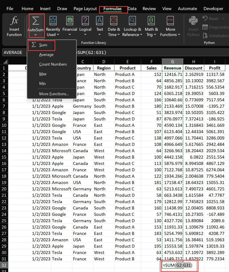
AutoSum is a feature that automatically detects adjacent cells with numbers and inserts multiple cells using a SUM function to add them up. It’s activated by pressing Alt + = or clicking the AutoSum button in the Home tab.
Imagine you have a spreadsheet with monthly sales figures for multiple products across different regions. Instead of typing =SUM(A1:A12) for each column, select all the cells below your data range and press Alt + =. Excel will select the range for each column for you and insert the sum formulas, saving you time and reducing the risk of errors.
This is so useful for quick analysis of numerical data and excel formulas. Whether you’re totaling expenses, calculating average scores or finding peak values for excel game, AutoSum can do it all with just a few keystrokes.
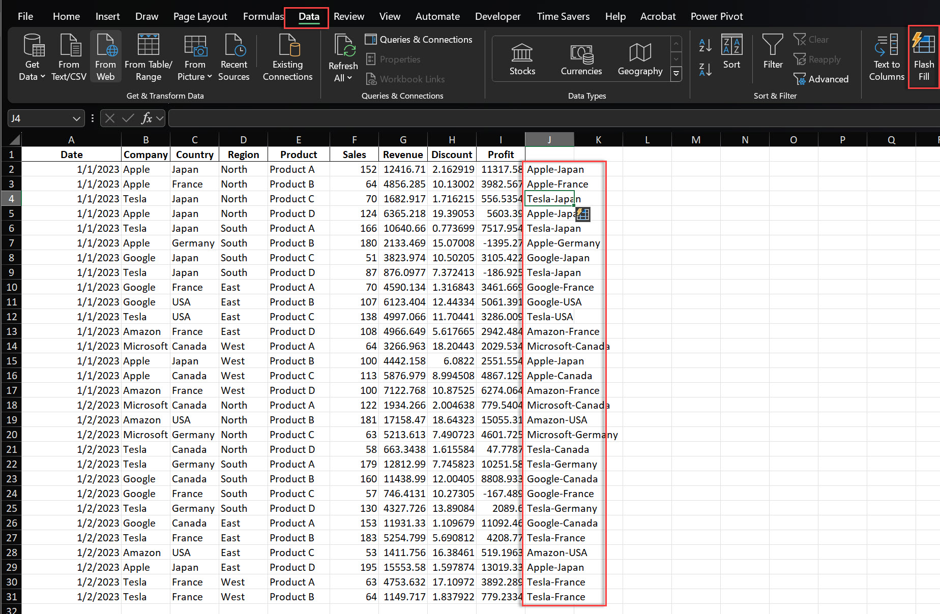
Flash Fill is a feature that uses pattern recognition to automate repetitive data entry. When Excel detects a pattern in your data entry, it can fill in the rest of the column for you. Activate it by pressing Ctrl + E or from the Data tab.
Here’s an example: Let’s say you have a column of email addresses ([email protected]) and you want to extract just the names. Start typing the names in a new column:
john.doe
jane.smith
After these two entries, press Ctrl + E. Excel will recognize the pattern and fill in the rest of the names for you.
Flash Fill isn’t limited to just splitting data. It can do a lot of other data manipulation tasks such as:
Combining data from multiple columns (e.g. first and last names)
Formatting data (e.g. add parentheses to phone numbers)
Extracting specific parts of text (e.g. get domain names from email addresses)
Clean up inconsistent data entries
Flash Fill is smart enough to learn from your examples. If it doesn’t get the pattern right the first time, you can manually correct a few more entries and Flash Fill will adjust its pattern recognition accordingly.
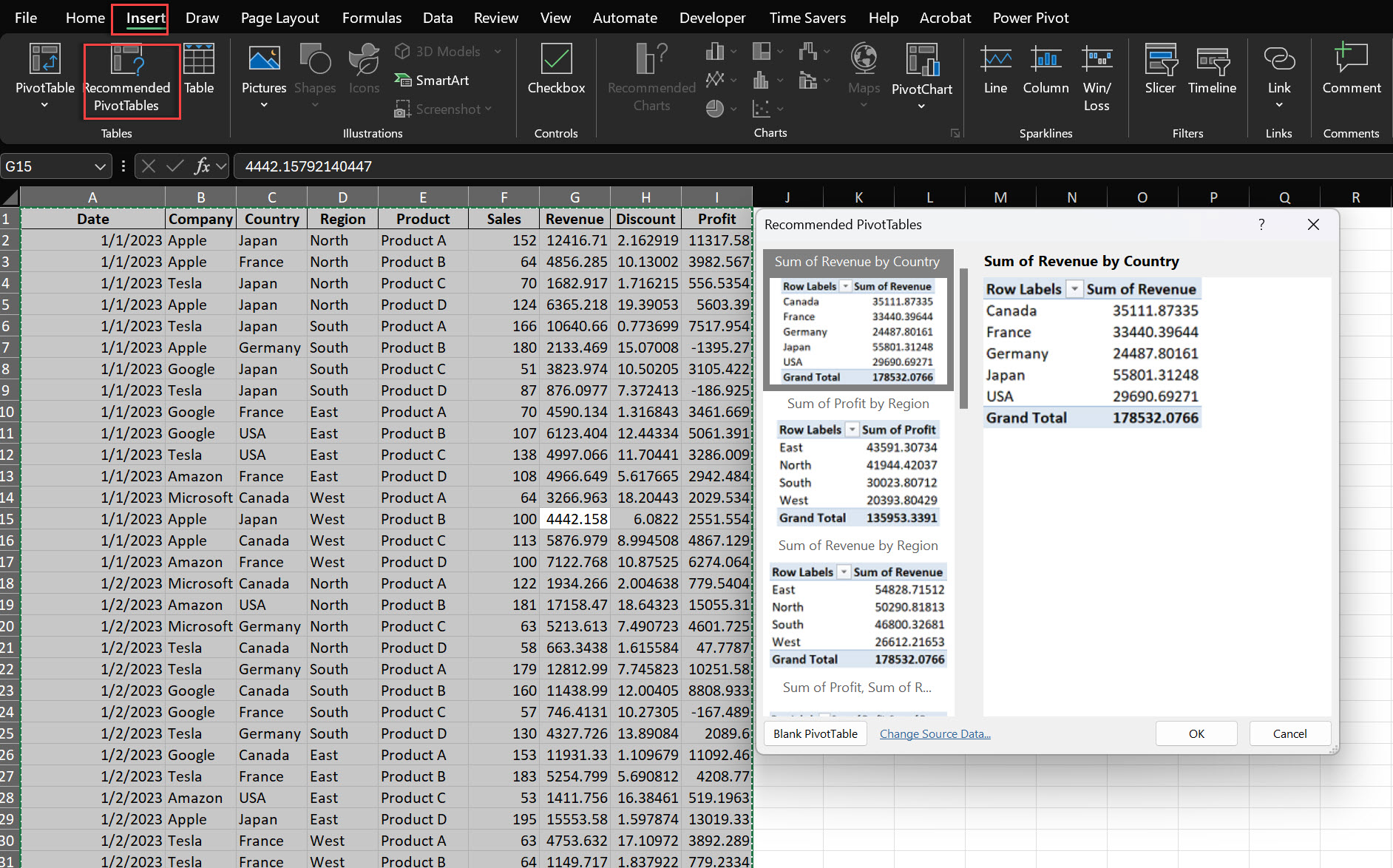
Pivot Tables are one of the most powerful features in Excel for data analysis but creating the right layout for pull data can be tricky. The Recommended Pivot Table feature makes it easy by suggesting pivot table layouts based on your data. Press Alt + N V or from the Insert tab.
Here’s a real-world example: You have a large sales dataset with columns for date, product, region, salesperson and amount. Recommended Pivot Tables might suggest:
Total sales by region and product
Monthly sales over time
Top salespeople by region
Product performance across regions
These suggested layouts give you instant answers to your data without you having to configure all the columns and Pivot Table fields yourself. It’s like having a data analyst built into Excel to your data validation help you find patterns and trends quickly.
The recommended layouts are a good starting point but don’t hesitate to modify them. You can add or remove fields, change the calculation type (e.g. from sum to average) or apply filters to focus on specific data subsets. This flexibility lets you tailor the Pivot Table to your exact analytical needs.
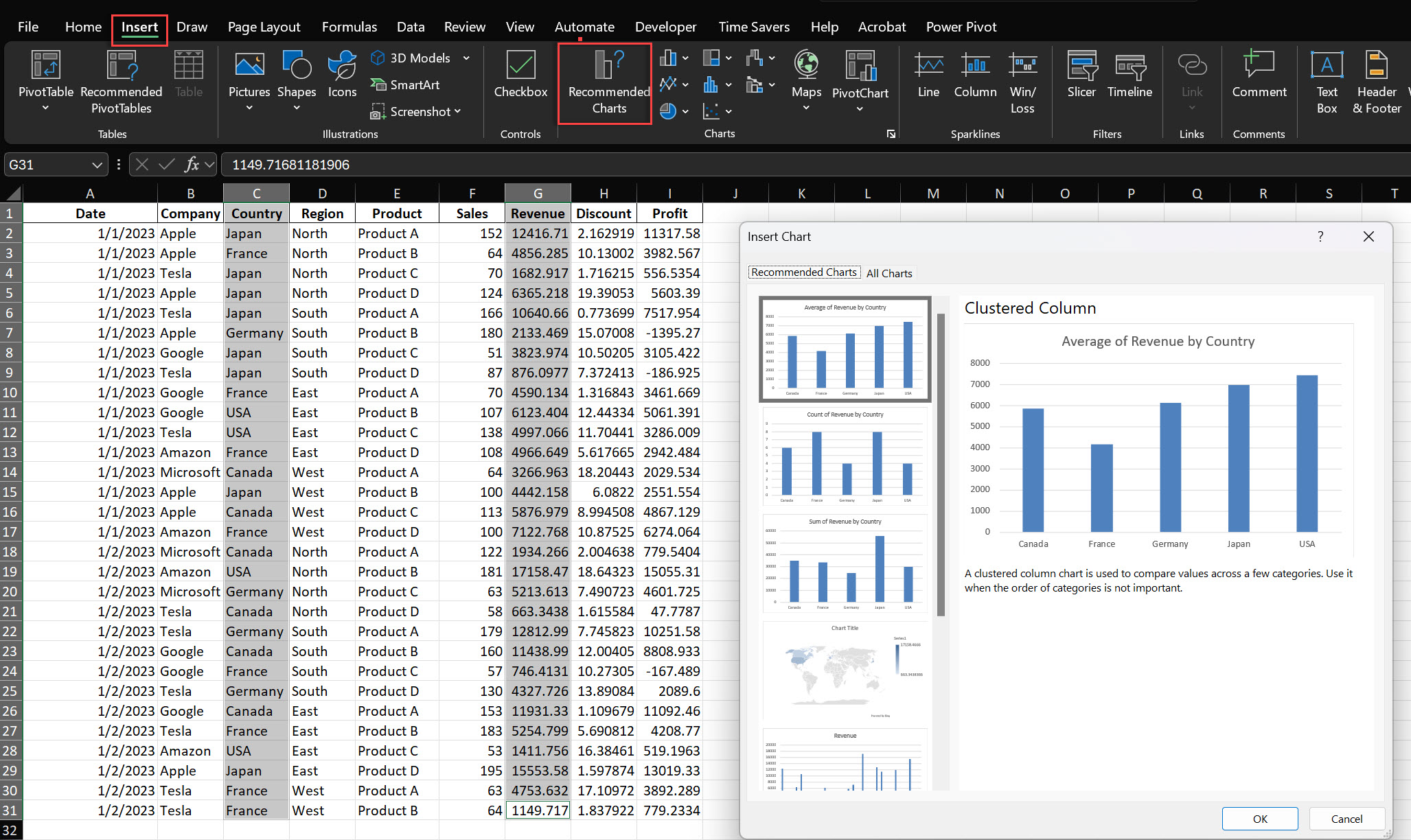
Data visualization is key to communication of insights but choosing the right chart type can be tricky. Excel’s Recommended Charts feature takes the guesswork out of this process by analyzing your data and suggesting chart types. Press Alt + N R or from the Insert tab.
When you select your data range and use this feature, Excel will show you a gallery of chart options that fit your data structure. These suggestions excel chart make are based on best practices in data visualization and will help you create charts fast.
For example, if you have time-series data or excel spreadsheet showing sales over months, Excel might suggest:
A line chart to show overall trend
A column chart to compare monthly values
An area chart to show cumulative growth
For categorical data like sales by product category, it might suggest:
A bar chart for simple comparison
A pie chart to show composition
A treemap for hierarchical data
Remember, while the recommended charts are a good starting point, you can always customize them further. After selecting a chart, use the Chart Tools tabs to modify colors, add data labels, change axis scales or add trendlines for more detailed analysis.
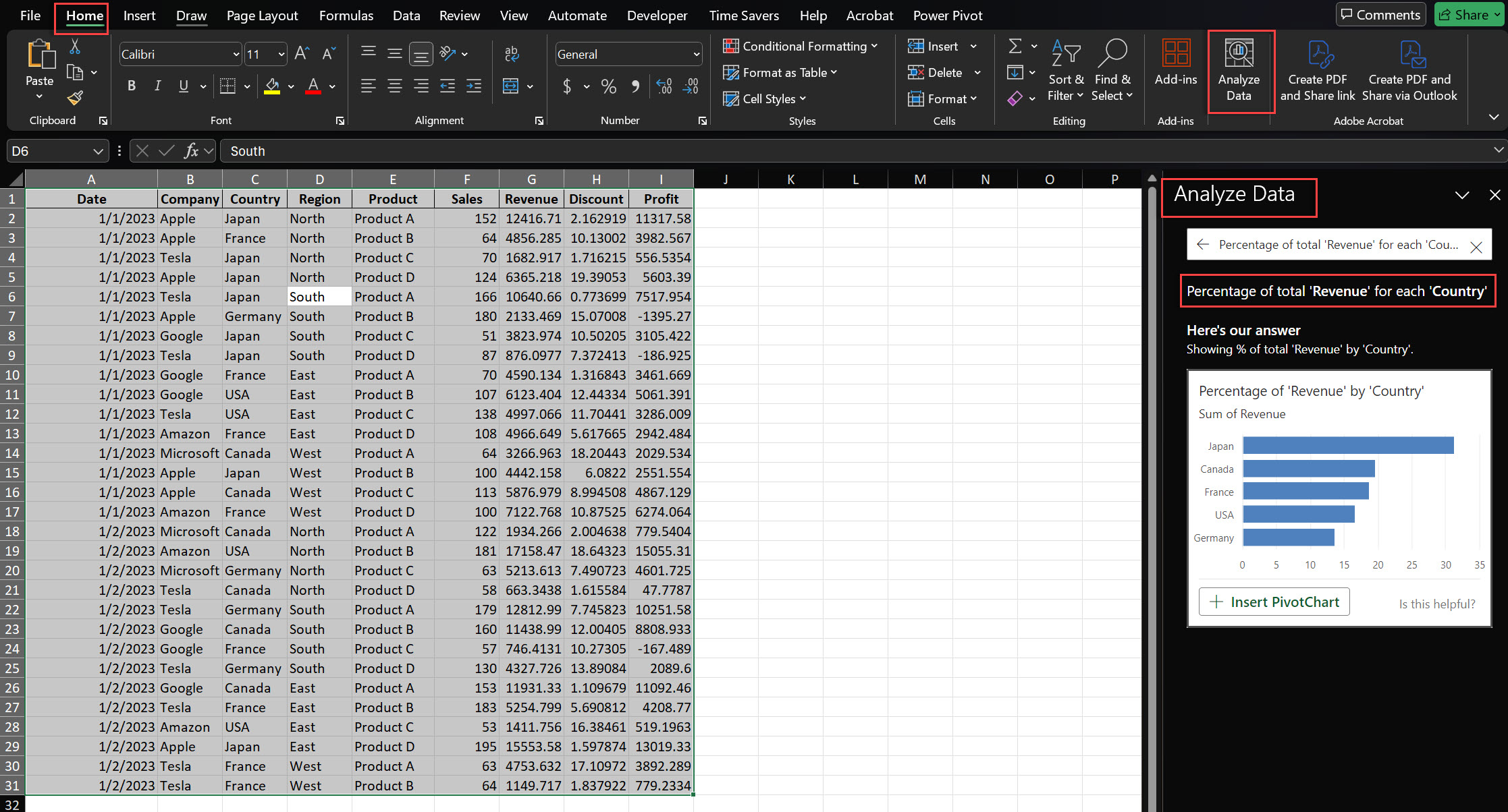
Analyze Data is Excel’s AI-powered feature that gives you quick insights, trends and summaries from your data. This will help you find patterns and anomalies that you might not have noticed otherwise, saving you time in the early stages of data exploration. Press Alt + Q, then type “Analyze Data”.
When you run Analyze Data on a dataset, Excel will generate a series of cards, each with a different insight about your data. These might include:
Summary statistics (e.g. totals, averages, min/max values)
Trend over time
Correlations between variables
Anomalies or outliers in your data
Breakdown of categorical data
For example, if you’re analyzing data security a sales dataset, Analyze Data might show a data presentation as:
A chart of sales over time, highlighting seasonal patterns
Breakdown of sales by region, showing top performing areas
Top selling products and their contribution to total revenue
Unusual spikes or drops in sales
Correlation between sales amount and time of year
These AI-driven insights are a good starting point for further analysis and help you focus on the areas to investigate. But always review them critically and use your domain knowledge to determine their relevance and accuracy.
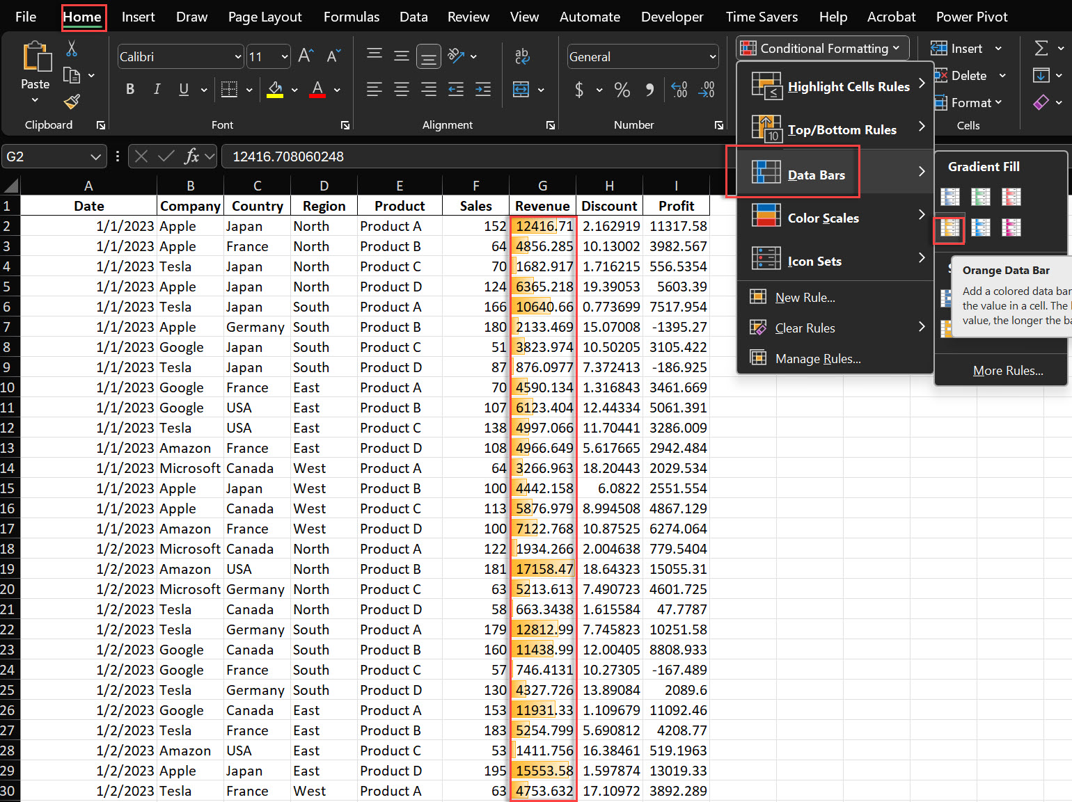
Conditional Formatting is an Excel feature that lets you automatically format cells based on their values or content. This visual approach to data analysis will help you spot patterns, trends and outliers in large datasets. Press Alt + O D or from the Home tab.
Excel has many formatting options:
Color scales: Apply gradient colors to different values
Data bars: Show bars within cells to represent values
Icon sets: Use icons to categorize data (e.g. red/yellow/green indicators)
Highlight rules: Format cells that meet specific conditions
Here’s an example of how Conditional Formatting can be used:
Imagine you’re reviewing a sales performance report. You could use Conditional Formatting to:
Apply a color scale to sales figures (e.g. red for low, yellow for average, green for high)
Use data bars to compare sales across different products or regions
Add icons (e.g. up/down arrows) to show performance trend
Highlight top performers (e.g. sales above a certain threshold) in bold or with a different background color
This will give you an instant view of overall performance and spot areas to investigate or potential issues.
Pro tip: You can apply multiple conditional formatting rules to the same range of cells. For example, you could use color scales and data bars to represent different parts of particular cells in your same data set and create a rich visualization.
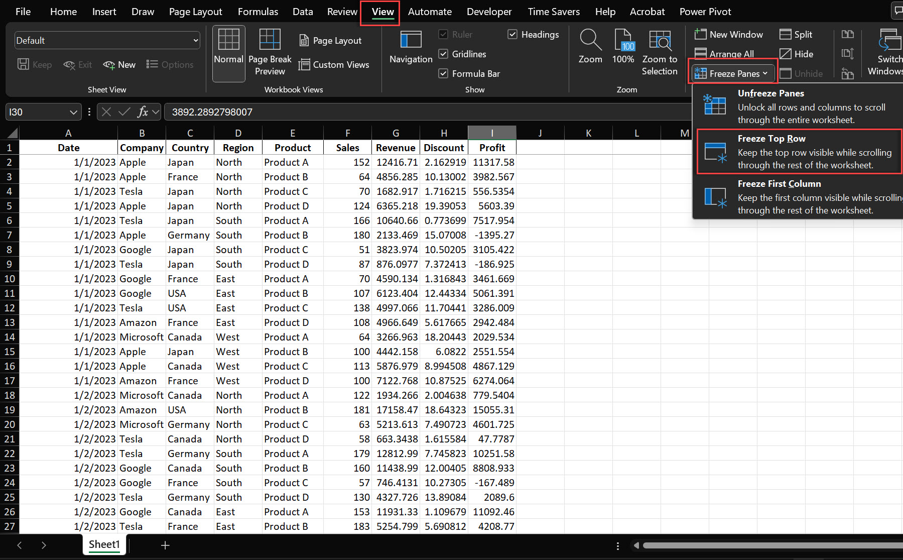
When working with large datasets, it’s easy to lose sight of column headers or row labels as you scroll through the entire data together. Freeze Panes solves this problem by allowing you to freeze certain rows or columns in place while the rest of the spreadsheet is scrollable.
Here are some examples of how to use Freeze Panes:
Freeze the top row: Keep column headers visible as you scroll down
Freeze the first column: Keep row labels visible as you scroll across
Freeze both top row and first column: For large datasets with both row and column headers
For example, if you’re working with a customer database with hundreds of rows and dozens of columns, you can freeze the top row of data table (with column headers like Name, Email, Purchase Date, etc.) and the first column (with customer IDs). This will allow you to scroll through the data and always know what data you’re looking at.
Freeze Panes is useful in situations like:
Financial models with many rows of time-series data
Project management sheets with many tasks and attributes
Large survey results with multiple question columns and respondent rows
By using Freeze Panes effectively, you can navigate large datasets with more than one row more easily and reduce errors and frustration from losing track of row or column headers.
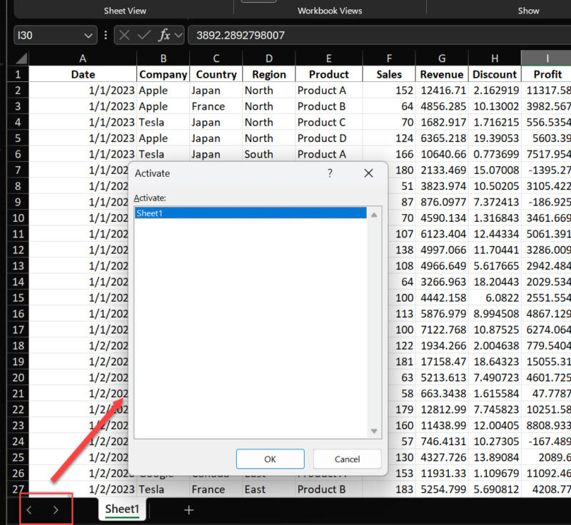
In large Excel workbooks with many sheets in multiple rows, navigating between them can be a pain, especially when you have more sheets than can fit in the bottom tab bar. The right-click sheet navigation tips is the solution.
To use this, right-click on the sheet navigation arrows in the bottom left corner of the Excel sheet. This will bring up a list of all sheets in the workbook and you can jump to any sheet with one more double click here.
By using this shortcut, you’ll save time and reduce the hassle of scrolling through many sheet tabs.
Pro tip: You can also use Ctrl + Up Arrow Key and Ctrl + Down Arrow Key to cycle through sheets sequentially. Combine this with the right-click navigation for quick movement through your workbook.
To learn Excel tricks:
Practice keyboard shortcuts
Explore the ribbon thoroughly
Learn advanced functions like INDEX-MATCH or SUMIFS
Master Pivot Tables and Charts
Experiment with Power Query for data transformation
This is subjective, but some impressive features include:
Creating dynamic dashboards with Power Query and Power Pivot
Using machine learning models with the FORECAST.ETS function
Building interactive games using VBA
Creating complex data visualizations with advanced charting techniques
To maximize Excel’s potential:
Learn keyboard shortcuts for efficiency
Use templates for common tasks
Leverage Power Query for data cleaning and transformation
Explore Power Pivot for data modeling
Use macros and VBA for repetitive tasks
Stay updated with new features and functions
Use shortcuts like CTRL + Shift + L for filters, or the VLOOKUP function to quickly find data in large spreadsheets.
Optimize file size by removing unused sheets, minimizing formatting, and using efficient formulas.
PivotTables, Power Query, and Data Analysis Toolpak are excellent for analyzing large datasets.
Use filters, conditional formatting, and tables for better data management and clarity.
Learn these 8 Excel tips and you’ll be more productive and efficient with your excel spreadsheets now. Use these shortcuts and features daily in excel files and you’ll save time, reduce errors and have new ways to interact with and analyze your data.

92% of students automate workflows, build CEO-ready dashboards, and streamline collaboration in < 1 hour. Don’t miss out!
🎯Master every Office 365 tool like Excel, Word, PowerPoint, Teams, Outlook and OneNote.
🎯Streamlined approach—no fluff, just rapid skill-building.
🎯Eliminate tedious tasks with intelligent automation.
🎯Transform everyday workflows into strategic power moves.
🎯Boost productivity and impress every boss.
🎯Real-World Projects – directly translate lessons into workplace wins.