Excel Charts: Explore our guide on mastering sparkline charts. Learn to create, customize, and use sparkline charts professionally for clear data insights.
by Mihir Kamdar / Last Updated:

This comprehensive guide on mastering Excel sparkline charts. By the end of this article, you’ll be able to:
Download our step-by-step tutorial file now by clicking on the icon ![]() below and follow along to enhance your Excel skills practically and efficiently!
below and follow along to enhance your Excel skills practically and efficiently!
Excel Sparkline charts are powerful mini-charts that allow you to visualize trends mark data points and patterns in your data directly within a cell or range of cells. These compact charts enable you to quickly identify key insights and communicate them effectively to your audience. In this comprehensive guide, we’ll explore the various aspects of creating and customizing Excel Sparkline charts, empowering you to enhance your data analysis and reporting skills.
For instance, when dealing with hidden and empty cells, you have the option to decide how these cells should be treated—either by showing gaps, zeros, or connecting the data points smoothly. Additionally, to ensure accurate representation, adjusting the vertical axis minimum helps align the scale, especially when comparing multiple sparklines across rows or columns. This is particularly useful when creating tiny charts that summarize trends or data points in a compact space, making it easier to spot patterns at a glance.
Excel sparklines are an incredible feature for visualizing data trends within cells, offering a compact and insightful way to analyze datasets. If you’re exploring what are sparklines or specifically what are sparklines in excel, they are miniature charts that provide a visual summary of data trends. Learning how to add sparklines in excel is straightforward—just go to the “Insert” tab, select the data, and choose your preferred sparkline type. Similarly, understanding how to insert sparklines in excel allows you to integrate these visual elements into your spreadsheets effortlessly.
A sparkline in excel can highlight patterns in sales data, performance metrics, or other key indicators. To get started, it’s essential to know how to create sparklines in excel or how to create a sparkline in excel. These tools make data visualization seamless and are perfect for dashboards. Additionally, excel what are sparklines provides insight into their functionality, while excel how to show the markers on the sparkline can emphasize key data points, such as highs, lows, or trends.
Using sparkline excel or sparklines excel ensures that your data is visually engaging and easy to interpret. For advanced applications, you might explore how to insert line sparklines in excel or how to add a sparkline in excel for precise trend tracking. Whether you’re working with excel sparkline or sparklines in excel, these features are invaluable for creating visually compelling reports. With tools like spark lines and spark lines excel, your data becomes more actionable, empowering better decision-making across all kinds of datasets.
Before diving into the creation process, let’s first understand what Excel Sparkline charts are and how they can benefit your data analysis and communication.

Excel Sparkline charts are small, cell-sized charts that are inserted directly into a cell or range of cells within a worksheet. They provide a visual representation of data trends, patterns, and fluctuations, allowing you click edit data and to quickly identify key insights without the need for a separate, full-sized chart.
Sparkline charts are particularly useful for:
Displaying data trends over time, such as stock prices or sales performance
Comparing multiple data series side-by-side, such as product sales or website traffic
Highlighting key data points or outliers within a dataset
Saving space in reports and dashboards by providing compact, in-cell visualizations
Sparkline charts offer several benefits for data visualization and communication:
1. Quick and Easy to Create: Sparkline charts can be inserted and customized with just a few clicks, making them a convenient choice for adding visual context to your data.
2. Space-Saving: By displaying mini-charts within cells, Sparkline charts allow you to present a large amount of data in a compact format, ideal for reports and dashboards with limited space.
3. Easy to Interpret: Sparkline charts provide a clear and intuitive visual representation of data trends and patterns, making it easier for your audience to grasp key insights at a glance.
4. Flexible and Customizable: Excel offers a range of customization options for Sparkline charts, allowing you to tailor their appearance and settings to suit your specific data and communication goals.
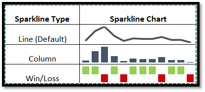
Excel offers three types of Sparkline charts, each suited for different types of data and visualization goals. Let’s explore each type and its characteristics.
Line Sparklines are the most commonly used type of Sparkline chart in Excel. They are ideal for:
Displaying trends and fluctuations in data over time, such as stock prices or website traffic
Comparing multiple data series with different colors or styles, such as sales performance by product or region
Emphasizing the overall direction and magnitude of change in a dataset
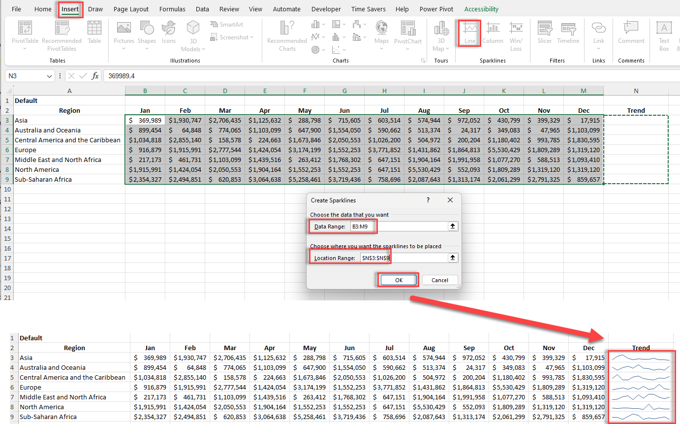
To create a Line Sparkline:
1. Select the cell or range where you want to insert the Sparkline.
2. Go to the Insert tab on the Excel ribbon and click on the Line Sparkline icon in the Sparklines group.
3. In the Create Sparklines dialog box, select the data range you want to use for the Sparkline and click OK.
Column Sparklines are similar to Line Sparklines but use vertical bars to represent data points. They are best used for:
Visualizing discrete data points or categories, such as monthly sales or survey responses
Comparing the relative magnitudes or frequencies of different data points
Identifying outliers or standout values within a dataset
To create a Column Sparkline:
1. Select the cell or range where you want to insert the Sparkline.
2. Go to the Insert tab on the Excel ribbon and click on the Column Sparkline icon in the Sparklines group.
3. In the Create Sparklines dialog box, select the data range you want to use for the Sparkline and click OK.

Win/Loss Sparklines, also known as “binary” Sparklines, display negative data points as a series of wins (positive values) and losses (negative values). They are useful for:
Displaying binary outcomes or status indicators, such as pass/fail or up/down
Tracking progress or milestones over time, such as project status or goal achievement
Highlighting successes, failures, or key events within a dataset
To create a Win/Loss Sparkline:
1. Select the cell or range where you want to insert the Sparkline.
2. Go to the Insert tab on the Excel ribbon and click on the Win/Loss Sparkline icon in the Sparklines group.
3. In the Create Sparklines dialog box, select the data range you want to use for the Sparkline and click OK.

To make your Sparkline charts more visually appealing and informative, Excel offers a range of formatting and customization options.
1. Select any cell containing a Sparkline or a group of Sparklines you want to format.
2. Go to the Sparkline tab on the Excel ribbon.
3. In the Style group, click on the More button (down arrow) to expand the Sparkline Styles gallery.
4. Choose a pre-defined style that suits your preferences or matches your workbook theme.
5. To customize the Sparkline colors, click on the Sparkline Color dropdown menu in the Style group and select a color for the Sparkline, markers, and other elements.

1. With your Sparklines selected, go to the Sparkline tab on the Excel ribbon.
2. In the Group group, click on the “Axis” button to open the Axis options.
3. Choose from the available options to customize the vertical axis scale and range, such as “Automatic,” “Same for All Sparklines,” or “Custom.”
4. To display or hide the horizontal axis and labels, click on the “Axis” button and select the desired option under “Horizontal Axis.”

1. With your Sparklines selected, go to the Sparkline tab on the Excel ribbon.
2. In the Show group, click on the “High Point,” “Low Point,” “Negative Points,” or “First/Last Point” checkboxes to highlight specific data points with markers.
3. To customize the marker color and style, click on the “Marker Color” or “Marker Style” dropdown menus in the Style group.

To create a sparkline chart in Excel, follow these steps:
Select the cell where you want to insert the sparkline.
Go to the Insert tab on the Excel ribbon.
In the Sparklines group, click on the type of sparkline you want to create (Line, Column, or Win/Loss).
In the Create Sparklines dialog box, select the data range you want to use for the sparkline.
Click OK to insert the sparkline in the selected cell.
Use the Sparkline Tools – Design tab on the ribbon to customize the appearance and settings of your sparkline.
The main differences between sparklines and charts in Excel are:
Size: Sparklines are small, cell-sized charts that fit within a single cell, while regular charts are larger and occupy a separate space on the worksheet.
Purpose: Sparklines are used to provide a quick, at-a-glance view of data trends and patterns, while charts are used for more detailed data visualization and analysis.
Interactivity: Regular charts offer more interactivity, such as the ability to hover over data points for more information or to filter and slice data, while sparklines are primarily static.
Customization: While both sparklines and charts can be customized, charts offer more extensive formatting and design options compared to sparklines.
To insert a mini graph (sparkline) into an Excel cell:
Select the cell where you want to insert the sparkline.
Go to the Insert tab on the Excel ribbon.
In the Sparklines group, click on the desired sparkline type (Line, Column, or Win/Loss).
In the Create Sparklines dialog box, select the data range you want to use for the sparkline.
Click OK to insert the sparkline in the selected cell.
If you’re looking for alternatives to sparklines in Excel, you can consider:
Mini charts: Create small, customized charts using Excel’s regular charting tools and resize them to fit within a cell or a small range of cells.
Conditional formatting: Use Excel’s conditional formatting features, such as data bars, color scales, or icon sets, to highlight data trends and patterns directly within cells.
To create a sparkline on a spreadsheet in Excel:
Select the cell where you want to insert the sparkline.
Navigate to the Insert tab on the Excel ribbon.
In the Sparklines group, click on the type of sparkline you want to create (Line, Column, or Win/Loss).
In the Create Sparklines dialog box, click on the “Select Data” button and highlight the data range you want to use for the sparkline.
Click OK to confirm the data range and close the dialog box.
The sparkline will appear in the selected cell. Use the Sparkline Tools – Design tab on the ribbon to customize the appearance and settings of your sparkline, such as the style, color, and axis options.
To create sparklines in Excel, go to the Insert tab on the ribbon, choose the Sparkline type (Line, Column, or Win/Loss), and specify the desired data range box in the dialog. Click OK to generate the Sparkline in the selected cell.
To insert sparklines:
Go to the Insert tab on the Excel ribbon.
Click on the type of Sparkline (Line, Column, or Win/Loss).
In the data range box, specify the data range to display in the Sparkline.
Select the target cell and click OK to insert the Sparkline.
When you create sparklines, Excel will prompt a data range box in the “Create Sparklines” dialog. You need to input or select the range of cells containing the data you want to visualize as a Sparkline.
Mastering Excel Sparkline charts is essential for professionals looking to enhance their data analysis and communication skills.
You’ve learned how to:
By putting these lessons into practice and continually refining your Excel Sparkline chart skills, you’ll be able to provide quick and meaningful data visualizations that set you apart as a data-driven professional.


