Learn how to build an Excel dashboard using Analyze Data with step-by-step instructions, prompts, and a real-world dataset.
by Mihir Kamdar / Last Updated:
After reading this guide, you’ll be equipped with the knowledge to:
Download our step-by-step tutorial file now by clicking on the icon below and follow along to enhance your Excel skills practically and efficiently!
Want to build a dynamic and professional-looking dashboard in Excel? Need a way to visualize your data without spending hours on complex formulas or manual pivot table creation? Excel’s Analyze Data feature lets you create pivot tables and charts automatically using natural language prompts.
In this tutorial, we will show you how to build a dashboard in Excel using Analyze Data with a real-world dataset. We will guide you through each step, from preparing your data to making your dashboards look modern and interactive. Additionally, we will provide specific prompts to use with Excel’s Analyze Data feature to create pivot tables and charts automatically.
An Excel dashboard is a powerful tool that provides a visual representation of data, allowing users to communicate complex information in a clear and concise manner. These dashboards are compact and interactive, enabling users to extract insights quickly, improve business decision-making, and identify trends and patterns. Excel dashboards can include raw numbers, tables, and various types of charts, such as clustered column charts, line charts, pie charts, and radar charts. They are versatile and can be used for performing complex data analyses, making them invaluable in nearly every industry and business use case
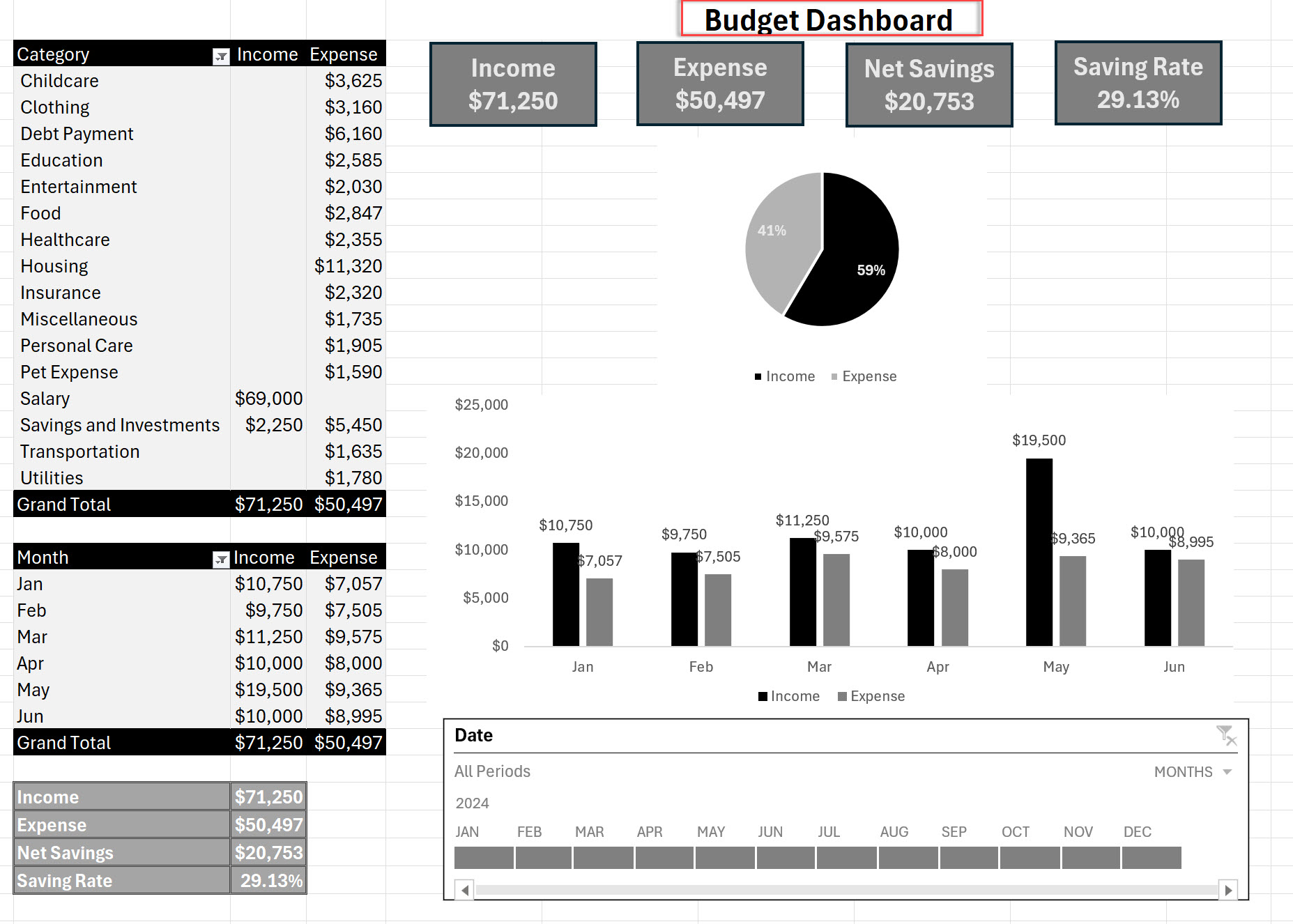
Excel dashboards are incredibly useful for several reasons. Firstly, they allow users to extract insights quickly, which is crucial for timely decision-making. By providing a clear and concise visual representation of data, dashboards help in identifying trends and patterns that might not be immediately obvious from raw data alone. This capability is essential for making data-driven decisions and improving business outcomes.
Moreover, Excel dashboards can display data in a manner that is easy to understand, even for those who may not be data experts. They can perform complex data analyses, identify areas for improvement, and track progress over time. This makes them a powerful tool for any business looking to enhance its decision-making process and overall efficiency.

Planning your Excel dashboard is a critical step to ensure it is effective and useful. Here are some steps to follow:
Define the Dashboard’s Objective and Scope
Before diving into the creation of your dashboard, it’s essential to define its objective and scope. Ask yourself: What is the purpose of the dashboard? What specific questions do you want to answer with it? Who is the target audience? What data will be used to create the dashboard? Answering these questions will help you create a clear and focused dashboard that meets the needs of its users.
Collect and Organize Data
Once you have a clear objective and scope, the next step is to collect and organize the data. This involves identifying the data sources, collecting the data, cleaning and transforming it, and organizing it into a logical structure. Ensuring that the data is accurate, complete, and relevant to the dashboard’s objective is crucial. You can use various data visualization tools, such as charts and tables, to help organize and display the data effectively. Pay attention to data points and ensure they are represented accurately to provide meaningful insights.
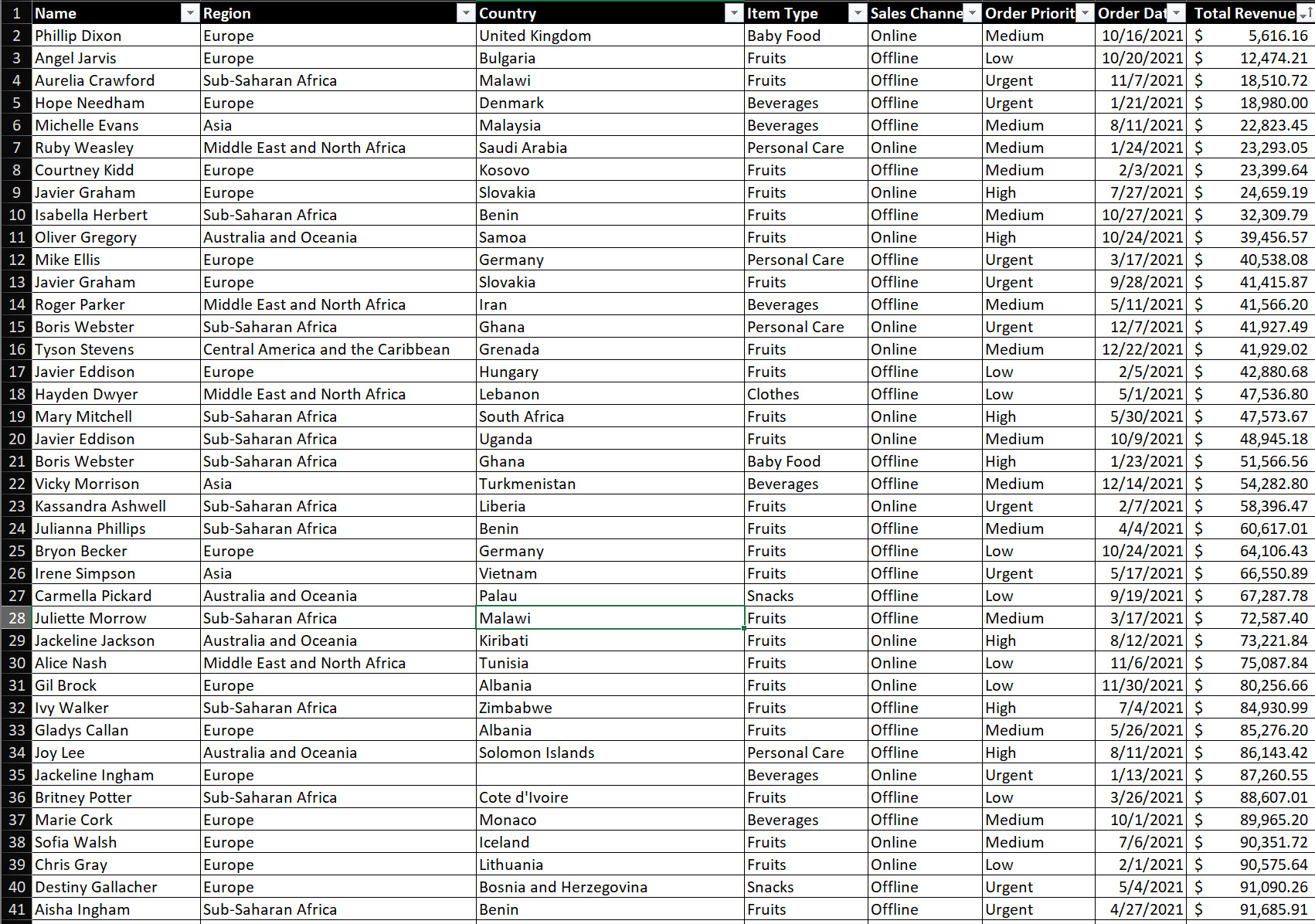
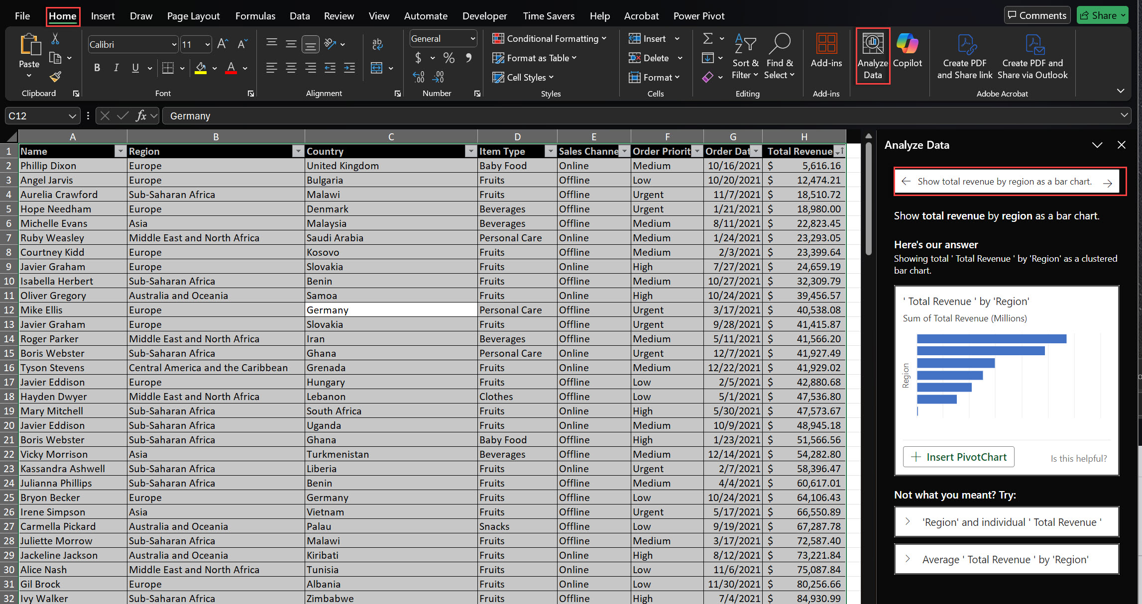
Excel’s Analyze Data feature lets you ask natural language questions to generate pivot tables and charts automatically.
Step-by-Step Instructions:
Access Analyze Data:
Click any cell within your table.
Go to the Home tab and click Analyze Data on the far-right.
Ask Specific Questions:
Use these prompts to generate pivot tables and charts for your dashboard:
Total Revenue by Region:
Prompt: “Show total revenue by region as a bar chart.”
Result: A bar chart for total revenue by region.
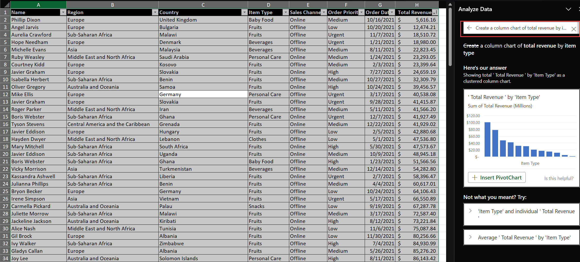
Total Revenue by Item Type:
Total Revenue Over Time:
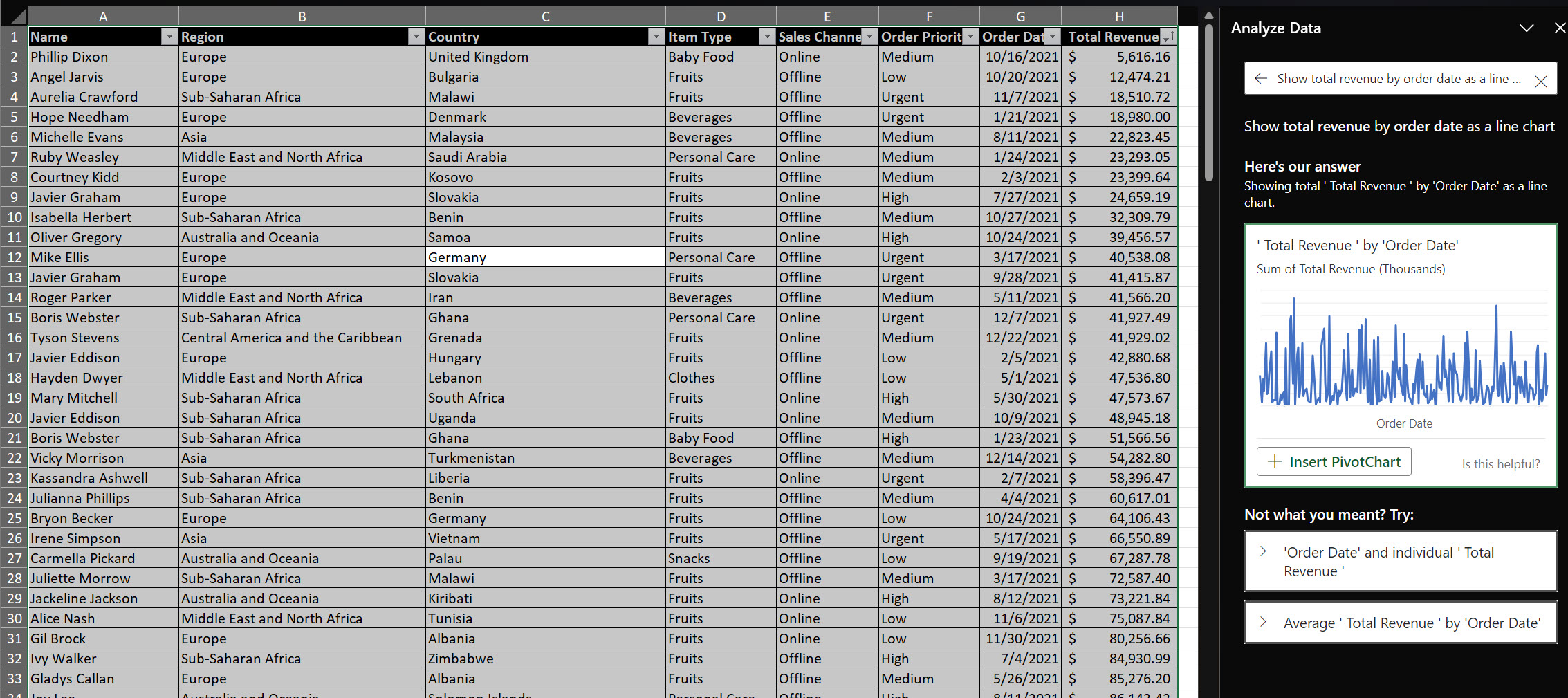
Total Revenue by Sales Channel:
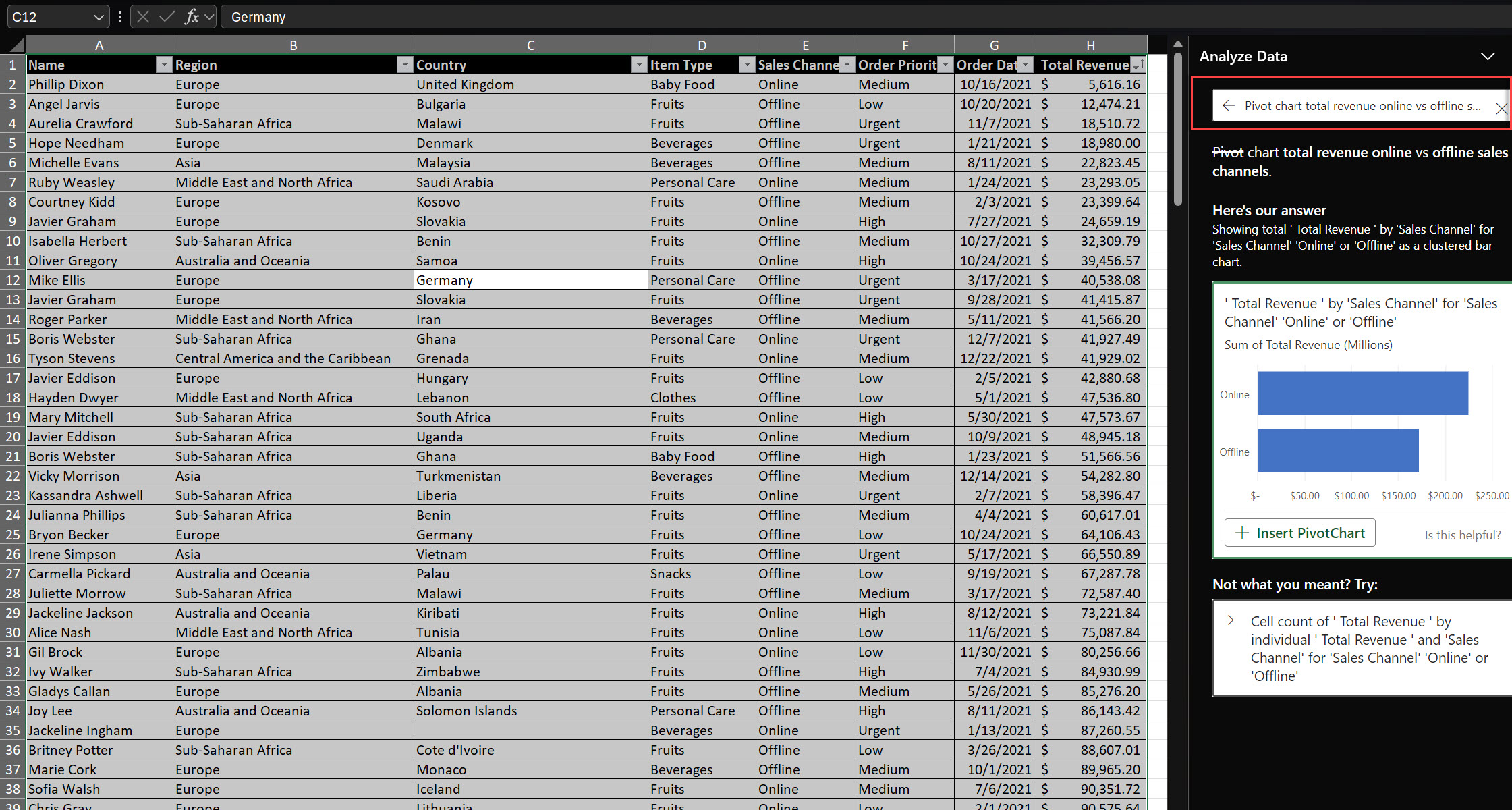
Top 5 Countries by Total Revenue:
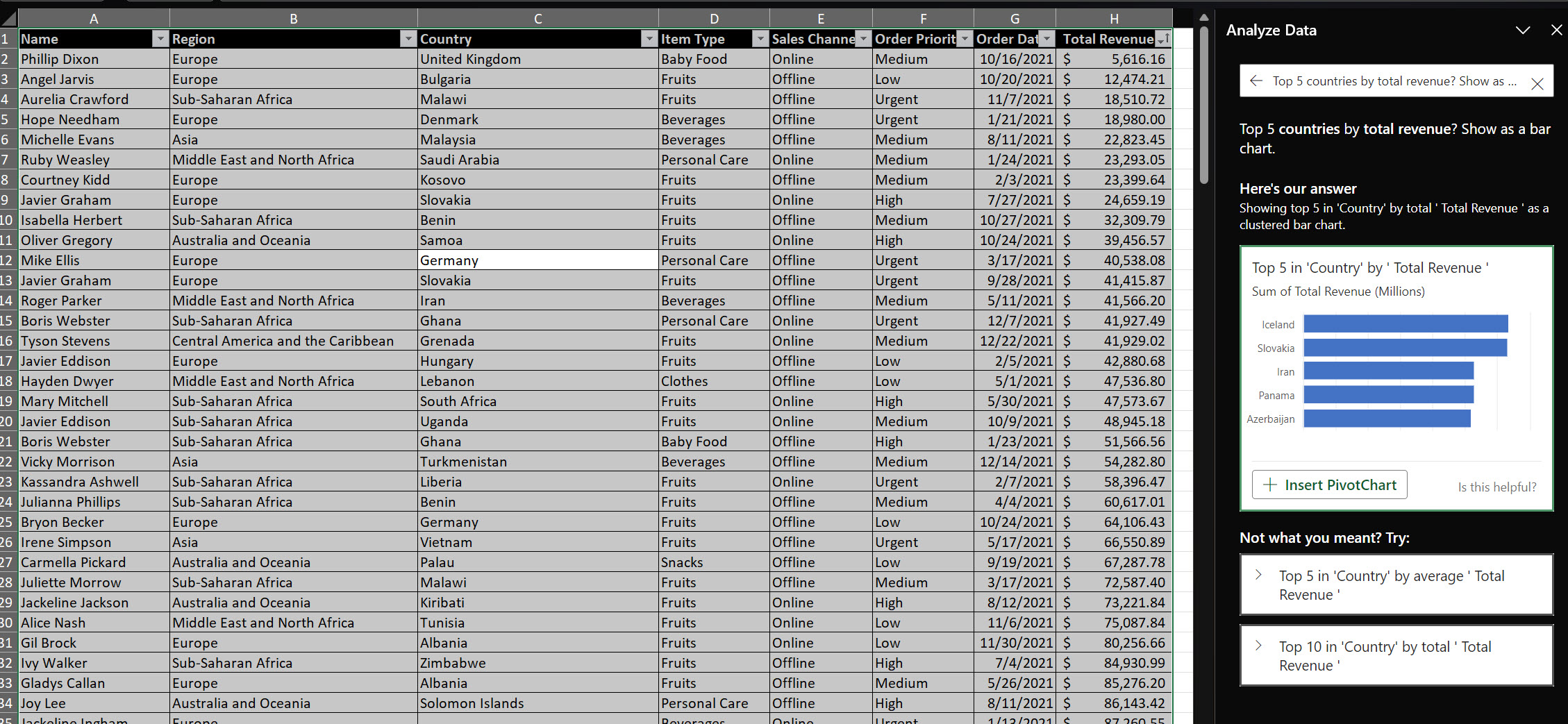
Now that you have your pivot tables and charts generated automatically using Analyze Data, it’s time to assemble them into a cohesive dashboard.
Step-by-Step Instructions:
Create a New Sheet:
Arrange Your Visuals:
Add Titles and Labels:
Ensure Consistency:
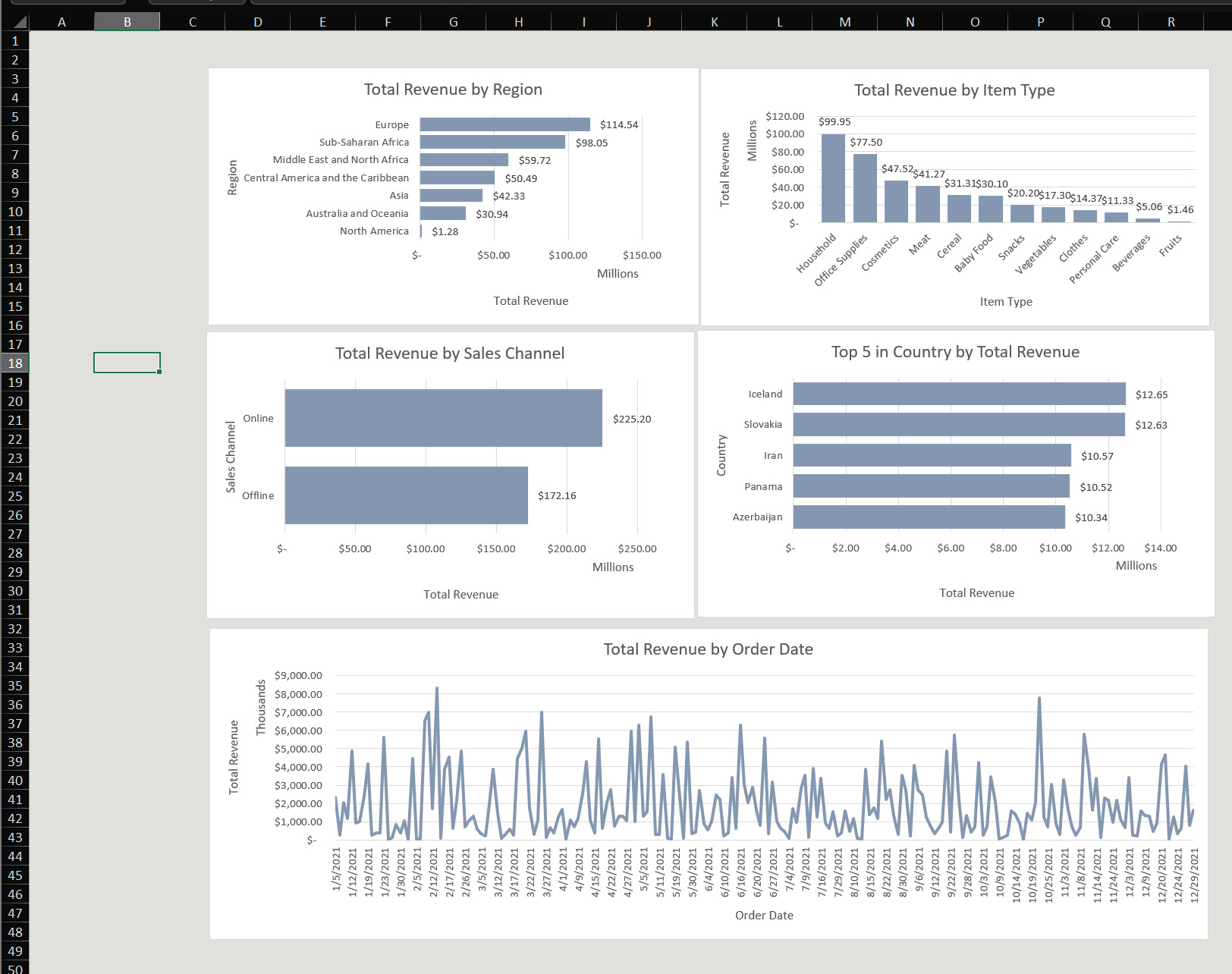
Interactivity enhances your dashboard’s usability, allowing users to filter and view specific data dynamically.
Step-by-Step Instructions:
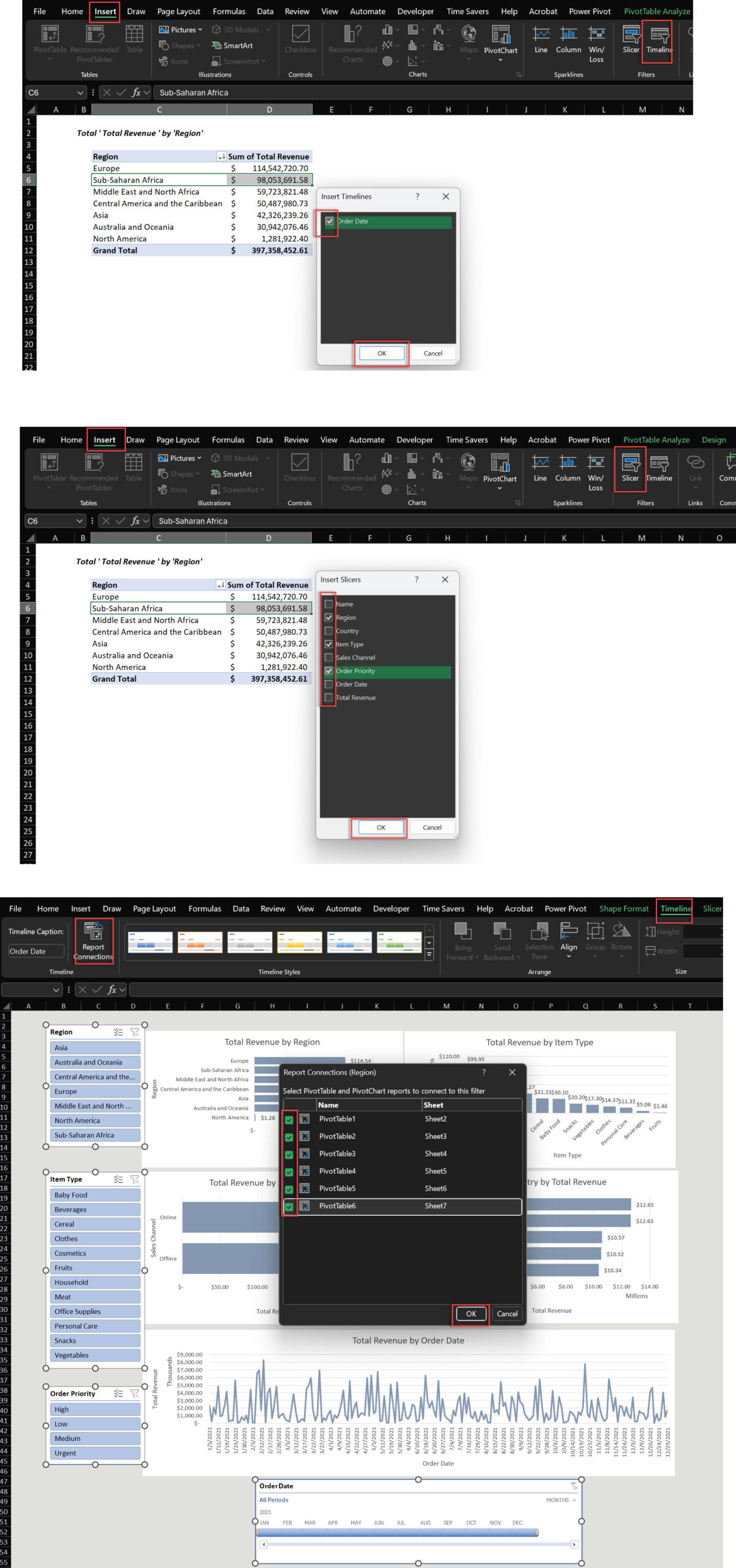
Insert Slicers:
Click on a pivot chart.
Go to the PivotChart Analyze tab and select Insert Slicer.
Choose fields like Region, Item Type, and Order Priority.
Insert a Timeline:
Click a pivot chart that has date data.
Go to PivotChart Analyze > Insert Timeline.
Select Order Date.
Connect Slicers and Timeline to Charts:
Right-click a slicer and select Report Connections (or PivotTable Connections).
Connect it to the relevant pivot tables and charts.
Format Slicers and Timelines:
Match their style to your dashboard theme.
Position slicers logically (e.g., left side or top).
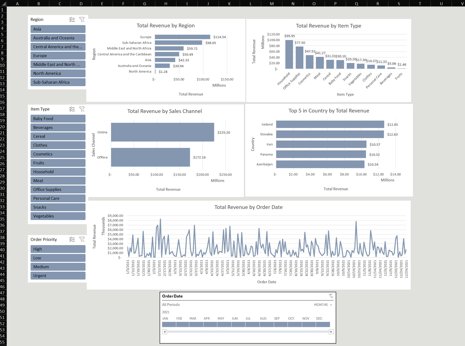
A visually appealing dashboard improves usability and impact.
Consistent Color Scheme:
Use 2-3 complementary colors and apply them to charts, slicers, and shapes.
Clean Fonts:
Use simple fonts like Arial or Calibri for readability.
Keep font sizes consistent across the dashboard.
Simplify Visuals:
Remove unnecessary gridlines and borders.
Use white space effectively to avoid clutter.
Branding:
Add your company logo and use brand colors where applicable.
Align and Resize Elements:
Ensure all charts and slicers are evenly aligned.
Use the Align tools under the Format tab.
Prepare Data: Organize and clean your dataset.
Use Analyze Data: Generate visuals automatically and create charts based on the data and prompts provided.
Build the Layout: Arrange visuals logically.
Add Interactivity: Use slicers and timelines.
Enhance Appearance: Apply professional design principles.
A pivot table is a tool to summarize large datasets dynamically. Analyze Data creates pivot tables automatically.
A pivot chart visually represents data in a pivot table. It updates automatically when the data changes. To create and select various chart types for effective data visualization, you can use the charts tab. The charts tab includes the ‘Recommended Charts’ tab and the ‘All Charts’ tab, allowing you to browse and choose the best chart type for your data.
Creating a dashboard in Excel is simple with Analyze Data. By asking natural language questions, you can automatically generate pivot tables and charts, saving time and effort.

92% of students automate workflows, build CEO-ready dashboards, and streamline collaboration in < 1 hour. Don’t miss out!
🎯Master every Office 365 tool like Excel, Word, PowerPoint, Teams, Outlook and OneNote.
🎯Streamlined approach—no fluff, just rapid skill-building.
🎯Eliminate tedious tasks with intelligent automation.
🎯Transform everyday workflows into strategic power moves.
🎯Boost productivity and impress every boss.
🎯Real-World Projects – directly translate lessons into workplace wins.