Learn how to build professional KPIs using shapes and SmartArt with step-by-step instructions. Perfect for business analysts and Excel users.
by Mihir Kamdar / Last Updated:
After reading this guide, you’ll be equipped with the knowledge to:
Download our step-by-step tutorial file now by clicking on the icon below and follow along to enhance your Excel skills practically and efficiently!
Discover how to create powerful Excel KPI dashboards that transform your data into actionable insights. Key Performance Indicators (KPIs) are vital metrics that help organizations measure and track their success.
A KPI is a measurable value organizations use to assess their effectiveness in achieving specific business objectives.
For inspiration, explore various Excel dashboard examples to understand effective layouts, visuals, and design techniques. Whether monitoring sales targets, tracking project progress, or analyzing business metrics, creating dashboards in excel is crucial for data-driven decision-making.
Mastering the art of building KPI dashboards in Excel can transform the way you track business performance. By organizing all your data in an Excel spreadsheet, you create a solid foundation for insightful analysis.
Leveraging a KPI dashboard Excel template ensures a professional design and saves time, while accurate KPI data provides actionable insights. For financial metrics, a financial KPI dashboard offers a clear view of revenue, expenses, and ROI, making it an essential tool for informed decision-making.
Start by connecting a reliable data source and working with a comprehensive Excel file to ensure your dashboard meets all your reporting needs. Creating a KPI dashboard in Excel can help you track and visualize performance metrics effectively. With tools like the KPI dashboard Excel template and customizable KPI format in Excel, you can design dashboards suited to your needs.
Whether you’re looking to build a KPI tracker in Excel for monitoring progress, a balanced scorecard KPI template for strategic planning, or specific options like a call center KPI dashboard Excel template, Excel offers flexibility and efficiency.
An Excel workbook serves as the foundation for your KPI dashboard, housing all necessary data and supporting analytics. Use data analysis to identify trends and patterns that inform the design of your Excel dashboard.
A KPI dashboard in Excel allows businesses to visualize performance metrics and track progress toward strategic goals. Start with an Excel KPI dashboard template to save time and ensure a professional layout for your dashboard.
Use a line chart to display comparisons between multiple data series, making performance trends easier to analyze. Efficiently importing data allows you to consolidate raw information for analysis and visualization in your dashboard.
The process to create dashboards in Excel involves using pivot tables, charts, and conditional formatting to present insights clearly.
Focus on specific data points when creating your Excel KPI dashboard to ensure the information is relevant and actionable. Excel charts are essential tools for transforming raw data into visual insights that are easy to interpret and act upon.
Creating KPI dashboards involves selecting the right data, using Excel’s tools like pivot tables and charts, and applying design principles to make the information easy to interpret.
Start with an Excel dashboard templates and modify it to create personalized, dynamic KPI dashboards that align with your objectives.
By learning how to create a KPI dashboard in Excel, you can tailor it to fit various industries, from construction to digital marketing, making performance tracking seamless and insightful.
The KPI dashboard template Excel provides an easy-to-use framework for organizing and displaying your KPIs. A well-organized KPI format Excel ensures that your key performance metrics are easy to interpret. If you’re wondering how to build a KPI dashboard in Excel, there are detailed guides available to walk you through the process.
How to make KPI in Excel with simple steps and start tracking your key business indicators efficiently. The KPI dashboard Excel template free download makes it simple to set up a performance tracking system in Excel. KPI scorecard template Excel provides a detailed view of your KPIs in a scorecard format, making it easier to assess performance. Track your business performance efficiently with a KPI tracker Excel template that updates in real-time.
Key Performance Indicators (KPIs) are measurable values that demonstrate how effectively an organization is achieving its objectives. They help evaluate the success of activities, initiatives, or processes within a business.
KPIs are essential across various business domains:
By leveraging KPIs, organizations can track progress, measure performance, and make informed decisions.
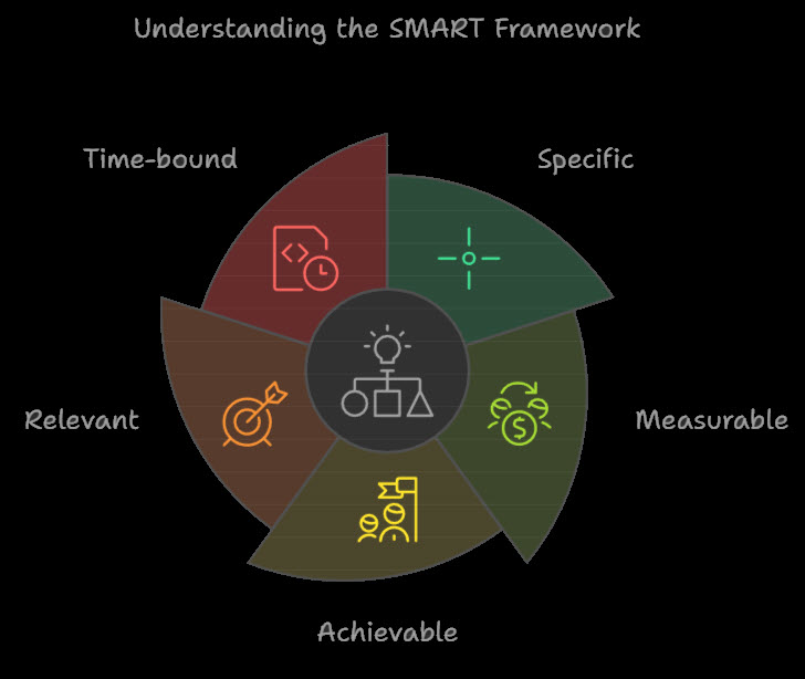
To set effective KPIs, it’s essential to use the SMART framework. SMART stands for Specific, Measurable, Achievable, Relevant, and Time-bound. This framework ensures that KPIs are clear, actionable, and aligned with the organization’s strategic objectives.
Specific: KPIs should clearly define what is being measured and what is expected. For example, instead of setting a vague goal like “improve sales,” a specific KPI would be “increase sales by 10% in the next quarter.”
Measurable: KPIs should be quantifiable, allowing for easy tracking and analysis. This means using metrics that can be measured objectively, such as revenue, customer satisfaction scores, or conversion rates.
Achievable: KPIs should be realistic and attainable, considering the organization’s resources and capabilities. Setting overly ambitious targets can be demotivating, while achievable goals encourage progress and success.
Relevant: KPIs should align with the organization’s strategic objectives and goals. This ensures that the efforts put into achieving the KPIs contribute to the broader mission and vision of the company.
Time-bound: KPIs should have a specific timeframe for achievement, providing a sense of urgency and focus. For instance, setting a deadline of “by the end of the fiscal year” helps prioritize efforts and track progress over time.

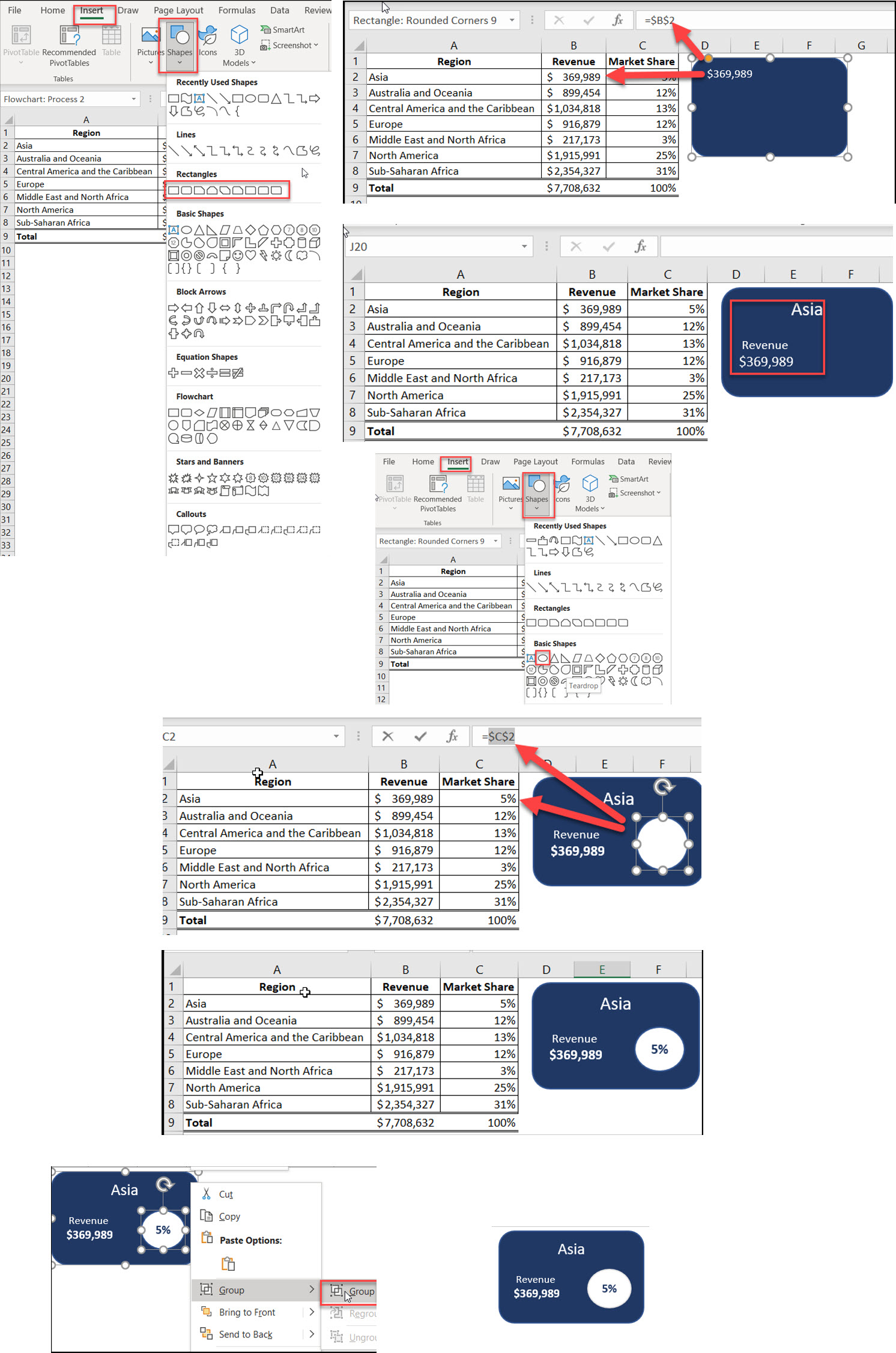
Build professional KPI visuals in Excel using shapes with these steps:
Finalize your design by grouping all elements and verifying data updates.

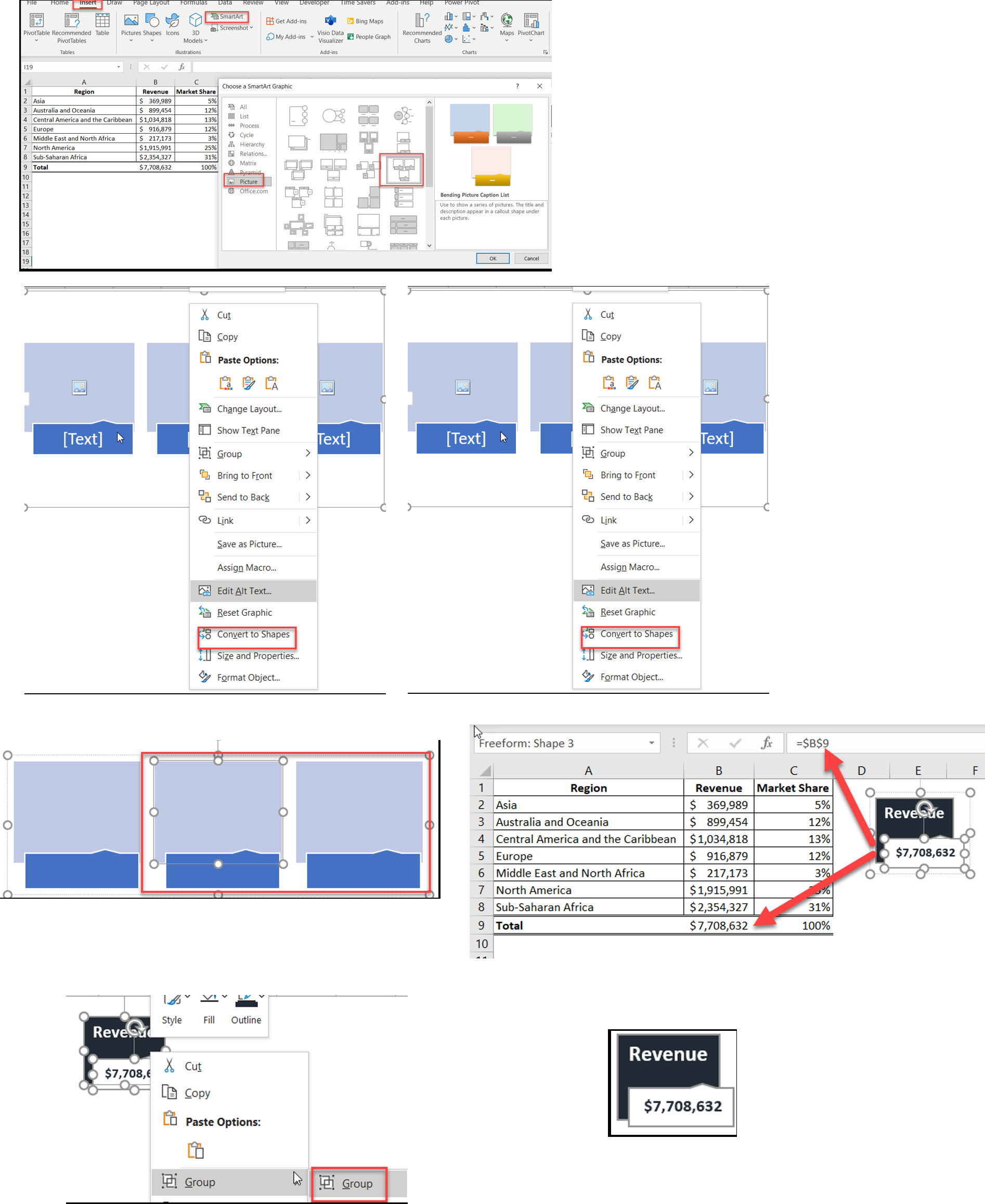
Transform your Excel dashboards using SmartArt KPIs for professional business reporting. You can also extract the text in excel.
Detailed SmartArt Method
Initial Setup
Insert → SmartArt
Select Picture category
Choose Bending Picture Caption List
Position on worksheet
Convert to Shapes
Right-click SmartArt
Select “Convert to Shapes”
Ungroup elements
Remove unnecessary parts
Customize Design
Modify individual shapes
Set color scheme
Format text elements
Adjust proportions
Link Dynamic Data
Select bottom shape
Enter cell reference in formula bar
Format numbers appropriately
Test data connection
Add Performance Indicators
Insert additional shapes
Link to performance metrics
Add conditional formatting
Include trend indicators

Implement industry-standard dashboard design principles for Excel KPI visualizations.
Design Principles
Visual Clarity
Use consistent fonts
Maintain adequate spacing
Implement clear hierarchy
Choose appropriate size
Color Strategy
Select contrasting colors
Use color psychology
Maintain brand guidelines
Ensure readability
Data Presentation
Show relevant context
Include comparison metrics
Display trends
Highlight important changes
Layout Guidelines
Organization
Group related KPIs
Align elements properly
Use grid layout
Maintain consistent spacing
Information Hierarchy
Most important KPIs on top
Logical flow of information
Clear visual progression
Easy-to-follow structure
A Key Performance Indicator (KPI) in Excel is a visual measure of performance designed to help users quickly evaluate the current value and status of a metric against a defined target.
To create a KPI in Excel, you typically need to define a base measure, set a target value, define status thresholds, and select an icon style.
Yes, Power Pivot in Excel allows you to create KPIs using calculated fields as base and target measures.
A measure is a calculated field, while a KPI is a visual representation of a measure’s performance against a target.
While you can use many metrics, it’s best to focus on the most important ones. Too many can lead to confusion.
To make your Excel dashboards look modern, focus on a clean, minimalist design with consistent colors and fonts. Incorporate dynamic visuals like slicers, sparklines, and interactive charts for better engagement. Use professional formatting, such as aligned elements and proper white space, to enhance clarity.
For Building dashboards in Excel, first gather and organize your data into a structured format. Use pivot tables and charts to summarize and visualize key metrics. Add interactivity with slicers, drop-down menus, or conditional formatting to make the dashboard user-friendly.
Master the art about how to create a dashboard in excel with these proven techniques. You can also take ideas and help from the various excel dashboard templates. Combine technical skills with design principles to create a professional dashboard using excel that drives better business decisions.

92% of students automate workflows, build CEO-ready dashboards, and streamline collaboration in < 1 hour. Don’t miss out!
🎯Master every Office 365 tool like Excel, Word, PowerPoint, Teams, Outlook and OneNote.
🎯Streamlined approach—no fluff, just rapid skill-building.
🎯Eliminate tedious tasks with intelligent automation.
🎯Transform everyday workflows into strategic power moves.
🎯Boost productivity and impress every boss.
🎯Real-World Projects – directly translate lessons into workplace wins.