Discover how to create a excel progress chart and eye-catching progress bars in Excel using five different methods. From simple conditional formatting to advanced chart techniques, this guide covers everything you need to enhance your spreadsheets with visual data representation.
by Mihir Kamdar / Last Updated:
In this guide, you’ll learn how to create various types of progress bars in Excel, including the following:
Using conditional formatting for quick progress bars in Microsoft Excel
Customizing progress bars with color-based rules
Creating dynamic progress bars with Excel formulas
Designing chart-based progress bars for professional looks
Crafting unique circular progress bars using Excel charts
Download our step-by-step tutorial file now by clicking on the icon below and follow along to enhance your Excel skills practically and efficiently!
In today’s data-driven world, the ability to visually represent information in Excel is crucial. Progress bars in an Excel spreadsheet offer a powerful way to transform raw data into intuitive, easy-to-understand graphics. Whether you’re tracking project completion, sales goals, or performance metrics, Excel progress bars can significantly enhance your spreadsheet’s impact and readability.
To create progress bar chart in Excel, start by selecting your data and choosing a stacked bar chart. Ensure you add a chart title that clearly defines what the chart represents, such as “Project Completion.” Next, select format data series to visually separate the completed and remaining portions. Include data labels to display percentage completion on the chart for clearer data analysis and better insight into progress tracking.
To effectively track progress, you can use a pie chart to visually represent the proportion of completed tasks. A clustered column chart is also a great option for displaying progress across multiple categories. These charts help to highlight the completion status of different goals, making it easy to compare and analyze performance over time.
An Excel Progress Chart is a visual tool used to track and represent progress toward a specific goal. It typically features a bar or circular chart that displays the percentage completion of a task or project. The chart is often updated dynamically as data changes, making it a great way to monitor progress in real-time. Excel’s built-in chart options, like the doughnut chart or bar chart, can be customized to create a progress tracker. This feature is ideal for project management and financial goal tracking.
Creating data visualizations and trackers in tools like Excel and Google Sheets can significantly improve project management and performance tracking. For instance, a plus minus bar graph is ideal for representing differences in data values and tracking performance variations. In Google Sheets, the progress tracker bar Google Sheets feature can dynamically monitor task completion, providing a visual representation of progress. Similarly, a progress chart can be used to track milestones and visualize completion rates effectively, whether in Excel or Google Sheets.
If you’re new to Excel, learning how to build a chart in Excel is crucial, with guides available to create stacked bars or progress bar charts. Pre-made options like a project tracker Excel template can simplify your workflow, combining features like progress bars and milestone tracking. For those seeking ready-made solutions, you can even download bar chart in Excel templates to get started quickly.
However, challenges such as resizing elements may arise, and knowing how to adjust long bars in Excel ensures your charts remain readable and proportionate. In Google Sheets, you can also explore ways to display progress percentage in cell, leveraging formulas to automate updates dynamically. These tools and techniques make it easier to track tasks, visualize data, and stay organized across projects.
A progress bar in Excel is a visual representation of the progress made towards a specific goal or target. It is a graphical tool that displays the percentage of completion of a task or project, making it easier to track and monitor progress. Progress bars in Excel can be created using various methods, including conditional formatting, formulas, and data visualization tools. By incorporating progress bars, you can transform numerical values into intuitive graphics, enhancing the readability and impact of your data. Whether you are tracking project milestones, sales targets, or performance metrics, progress bars in Excel provide a clear and immediate understanding of how far you’ve come and how much further you need to go.
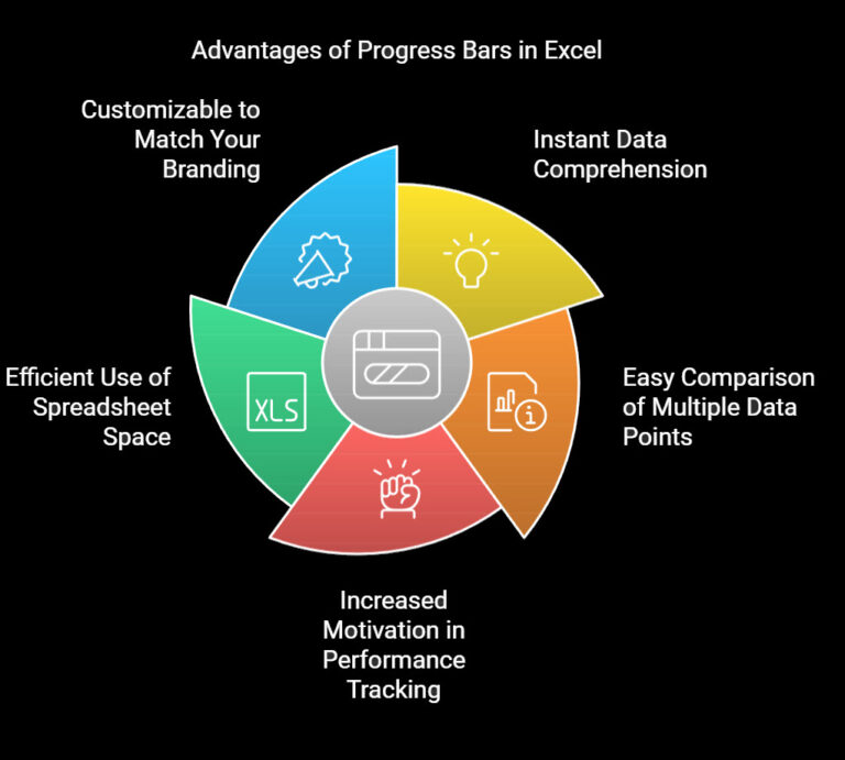
Instant data comprehension
Easy comparison of multiple data points
Increased motivation in performance tracking
Efficient use of spreadsheet space
Customizable to match your branding
Let’s dive into the five most effective methods to create progress bars and progress charts in Excel, each offering unique advantages for different scenarios.
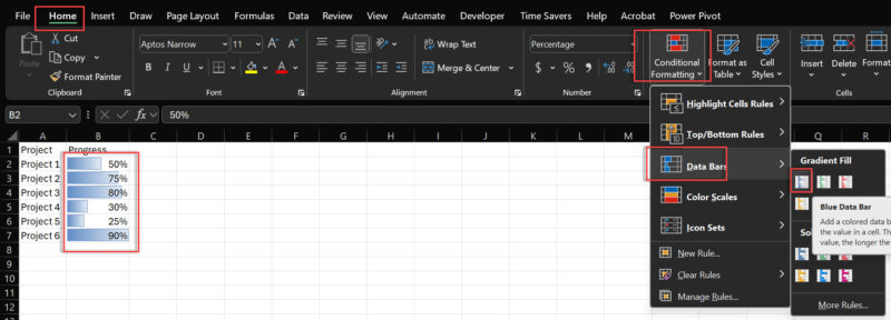
Conditional formatting rule is the fastest way to create basic progress bars in Excel.
Step-by-Step Guide:
Enter your data (percentages or values)
Select the data range
Go to Home > Conditional Formatting > Data Bars
Choose a style or select More Rules for customization
Pro Tip: Use solid fill data bars for a cleaner look in your Excel progress bars.
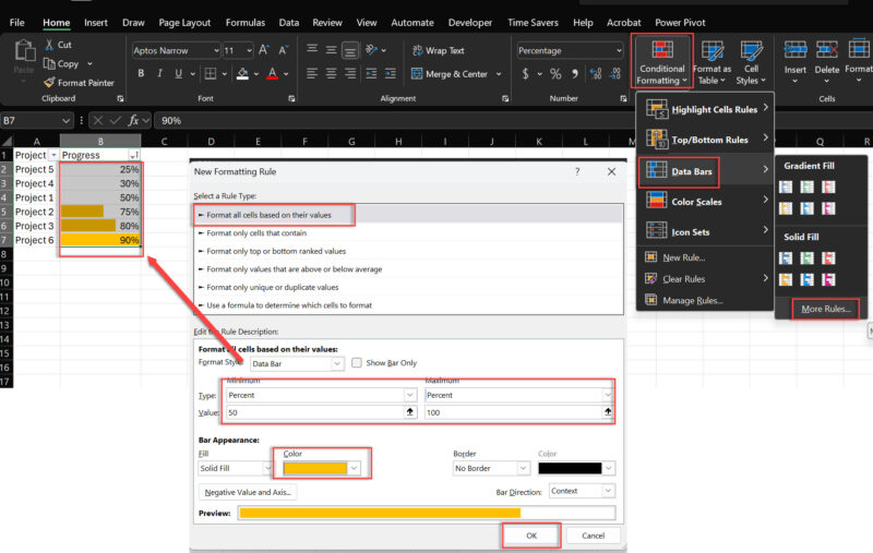
Take your Excel progress bars to the next level by adding color-coding and adjusting the font color based on specific conditions.
How to Set It Up:
Select your data range
Go to Conditional Formatting > New Rule
Choose “Format all cells based on their values”
Select the minimum percent to 50 and the maximum percent to 100.
Set a color > Press OK
This method allows you to create Excel progress bars that change color based on performance thresholds, making it easy to spot high and low performers at a glance.
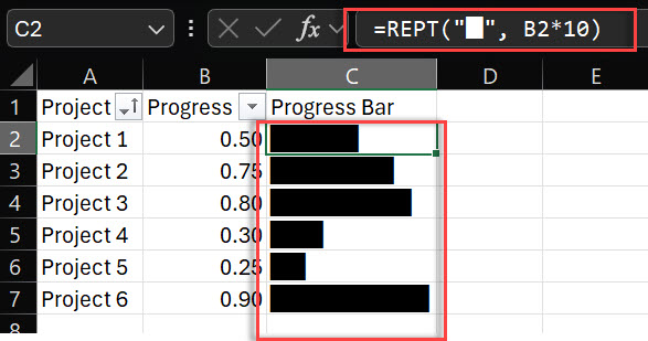
For more control over your progress bar appearance, use Excel formulas to create dynamic, text-based bars. Adjusting the column width alongside row width can enhance the visibility and readability of these progress bars.
The REPT Function Method:
In an adjacent cell, enter: =REPT(“█”, B2*10)
Adjust cell formatting (font, alignment) for best visual effect
This formula creates a progress bar using square characters, filled based on the percentage in cell B2.
Excel Tip: Experiment with different characters like “|” or “█” to find the style that best fits your spreadsheet design.
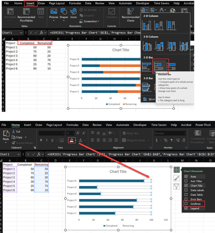
For a more polished look, leverage Excel’s charting capabilities to create sleek progress bars.
Creating Chart-Based Progress Bars:
Set up data with “Completed” and “Remaining” columns
Insert a Stacked Bar Chart
Format the “Remaining” series with no fill
Remove gridlines and axes for a clean look
Charts offer more customization options, allowing you to create Excel progress bars that perfectly match your reporting style.
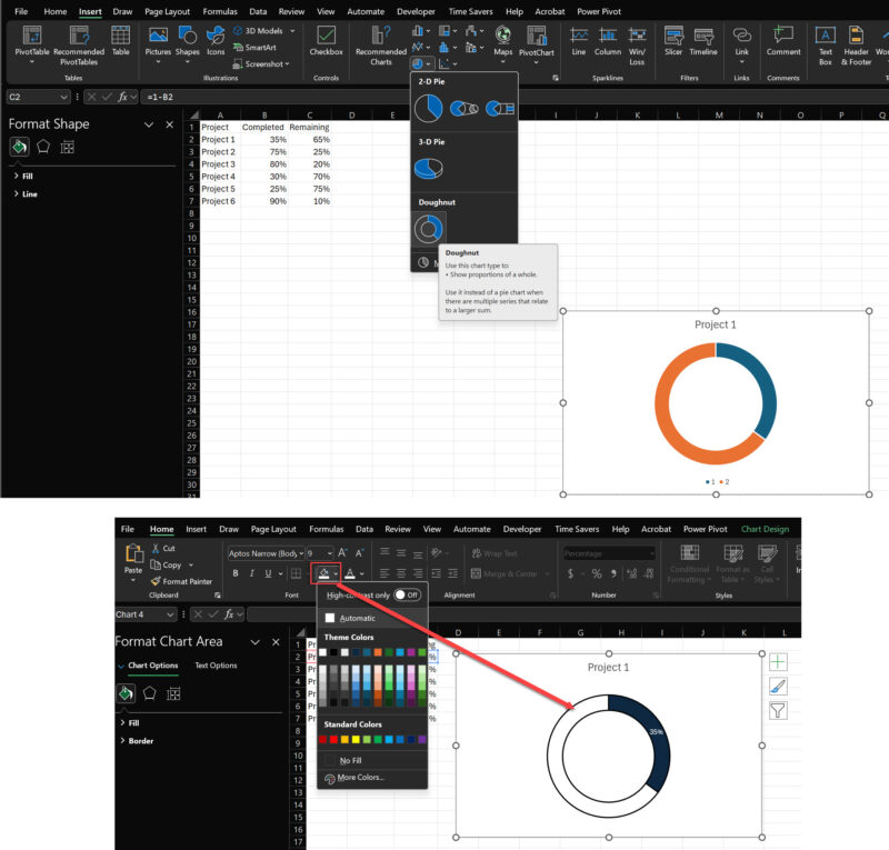
For a unique twist, create progress charts like circular progress bars using Excel’s doughnut chart feature.
Steps to Create Circular Progress Bars:
Set up data with “Completed” and “Remaining” percentages
Insert a Doughnut Chart
Format the “Remaining” series with a light or no fill
Adjust the chart to show only the outer ring
Circular progress bars in Excel are perfect for displaying individual KPIs or completion rates in a visually striking way.
Creating effective progress bars in Excel involves more than just adding a visual element to your spreadsheet. Here are some tips to ensure your progress bars are both functional and visually appealing:
Use a clear and concise title: Make sure the title of your progress bar clearly indicates what it represents, such as “Project Progress” or “Task Completion Rate.” This helps users quickly understand the context of the data.
Choose a suitable color scheme: Select colors that are easy to distinguish and convey the desired meaning. For example, green can represent progress, while red can indicate delays or issues. Consistent use of color helps in quick data comprehension.
Use a consistent scale: Ensure that the scale of your progress bar is consistent and easy to understand. For example, use a percentage scale from 0 to 100%. This uniformity makes it easier to compare different progress bars.
Make it interactive: Consider adding interactive elements to your progress bar, such as hover-over text or clickable links, to provide additional information or context. This can make your data more engaging and informative.
Keep it simple: Avoid cluttering your progress bar with too much information or complex graphics. A simple design is often more effective and easier to understand.
Use conditional formatting: Utilize conditional formatting to highlight important milestones or thresholds, such as 50% or 100% completion. This can draw attention to critical points in your data.
Update regularly: Regularly update your progress bar to reflect changes in the project or task status. An up-to-date progress bar ensures that your data is always accurate and relevant.
Use data visualization tools: Consider using advanced data visualization tools, such as ChartExpo, to create more sophisticated and interactive progress bars. These tools can offer additional customization options and enhance the overall look of your progress bars.
Make it dynamic: Use formulas and conditional formatting to make your progress bar dynamic and responsive to changes in the data. This ensures that your progress bar automatically updates as your data changes.
Test and refine: Test your progress bar with different data sets and refine the design as needed to ensure it is effective and easy to use. Continuous improvement will help you create the most effective visual representation of your data.
By following these tips, you can create progress bars in Excel that not only look great but also provide valuable insights into your data. Whether you are using simple conditional formatting or advanced chart techniques, these best practices will help you make the most of your progress bars.
To add a basic progress bar in Excel:
Enter your data (e.g., percentages)
Select the data range
Go to Home > Conditional Formatting > Data Bars
Choose a style or customize as needed
Create a progress tracker by:
List tasks or milestones in column A
Add completion percentages in column B
Use conditional formatting data bars on column B
Optionally, add a total progress cell using AVERAGE function
Make a status bar using the REPT function:
In a cell, enter: =REPT(“■”, A1*10)&REPT(“□”, 10-A1*10)
Replace A1 with your percentage cell
Adjust cell formatting for best visual effect
Create a progress dashboard by:
Organize data with tasks, percentages, and dates
Use conditional formatting for visual progress bars
Add charts (e.g., stacked bar charts) for overall progress
Include summary statistics using functions like AVERAGE and COUNT
Use slicers or drop-down lists for interactivity
Create a progress bar using one of these methods:
Conditional formatting data bars
REPT function for text-based bars
Stacked bar charts
Formulas with custom cell formatting
Insert a status bar by:
Select a cell or range
Go to Insert > Charts > Bar Chart > Stacked Bar
Format the chart to show only the relevant data series
Remove gridlines and axes for a clean look
Track progress effectively by:
Set up a structured worksheet with tasks and milestones
Use percentage completion or status columns
Implement formulas for automatic progress calculation
Use conditional formatting or charts for visual representation
Regularly update the tracker and review progress
Mastering these five methods of creating progress bars in an Excel spreadsheet will significantly enhance your data visualization skills. From simple conditional formatting to advanced chart techniques, each method offers unique benefits for different scenarios.
Remember, the key to effective data visualization in Excel is choosing the right type of progress bar for your specific needs. Experiment with these techniques to find what works best for your data and audience.
To effectively monitor progress, creating a completion graph is a valuable strategy, and tools like Excel make it easy to design multiple charts. For example, you can create a completion graph to track milestones or use a sample project tracker Excel for ready-made solutions. Incorporating an Excel progress bar into your workflow helps visualize progress, and templates like a step by step progress tracking spreadsheet template free or a task list progress tracker Excel template free provide additional structure. Using a barchart Excel can help represent data visually, while adding a progress bar in Excel or exploring methods for progress bar in Excel customization ensures better control over tracking.
Tools such as an adjustable progress bar can further enhance flexibility in monitoring activities. Whether you’re creating a workflow chart in Excel or a progressive chart, having visual tools for updates is essential. Advanced options like a progress bar excel, a progress bar Google Sheets, or a process chart template Excel make it easy to track progress across different platforms. Learning what is the status bar in excel can also enhance your ability to manage projects efficiently. For further customization, using progress charts or a progress chart excel can streamline your tasks. Additionally, you can build a progress graph in tools like Excel to monitor advancements, and tutorials on how to make a workflow chart in excel or how to make progress bar in excel simplify complex processes.

92% of students automate workflows, build CEO-ready dashboards, and streamline collaboration in < 1 hour. Don’t miss out!
🎯Master every Office 365 tool like Excel, Word, PowerPoint, Teams, Outlook and OneNote.
🎯Streamlined approach—no fluff, just rapid skill-building.
🎯Eliminate tedious tasks with intelligent automation.
🎯Transform everyday workflows into strategic power moves.
🎯Boost productivity and impress every boss.
🎯Real-World Projects – directly translate lessons into workplace wins.