Our step-by-step guide covers 8 excel advanced features for data analytics tools, customizable dashboards and data visualizations that drive data-driven decisions.
by Mihir Kamdar / Last Updated:
This comprehensive guide on tools for building an interactive Excel dashboard. By the end of this article, you’ll be able to:
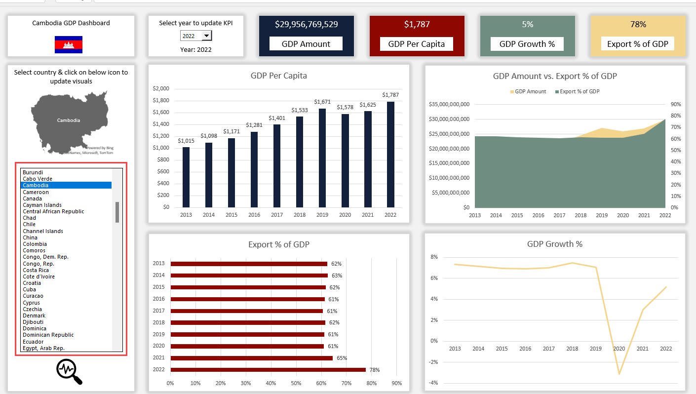
In today’s data-driven world, Excel dashboards have become an essential tool for professionals looking to make informed decisions quickly. By mastering advanced Excel features, you can create dynamic and interactive dashboards that not only display data but also allow users to explore and gain deeper insights from it. In this comprehensive guide to creating interactive dashboards, we’ll walk you through 9 powerful Excel features that will elevate your dashboard skills to the next level.
We’ll be using a single Excel file throughout this tutorial to demonstrate each step, ensuring a cohesive learning experience. By the end of this article, you’ll have the knowledge and practical skills needed to take Excel skills and create a professional-grade dashboard that will impress your colleagues and drive data-driven decision-making in your organization.
Excel offers a wide range of tools for analyzing data effectively. With the Excel Analyze Data feature, users can transform raw data into actionable insights. If you’re wondering how to use Excel for data analysis, start by exploring the Analyze tab in Excel, which is packed with essential features for both basic and advanced data analysis. One of the key elements is the data analysis button in Excel, which provides access to tools like regression, correlation, and descriptive statistics. To get started with basic data analysis in Excel, you can use sorting, filtering, and formulas like SUM, AVERAGE, and COUNTIF to gain quick insights.
For those unsure where the data analysis button in Excel is located, you can find it in the Data tab under the Analysis group. Learning how to analyze data in Excel becomes more effective with the use of pivot tables, charts, and advanced formulas like VLOOKUP and INDEX-MATCH. Additionally, Excel’s analytics with Excel capabilities allow businesses to visualize trends, forecast outcomes, and make data-driven decisions. Beginners often ask, “How can you use Excel to analyze data?” The answer lies in mastering simple yet powerful tools like conditional formatting and data validation.
The Analyze tab in Excel simplifies tasks such as What-If analyses and Solver models, making it easier to handle complex datasets. Whether you’re performing basic data analysis in Excel or diving into more advanced techniques, the tools available ensure professional-grade results. Using data to understand Excel better and practicing with datasets will enhance your analytical skills. Knowing where the Analyze tab in Excel is ensures quick access to key tools, empowering users to generate meaningful reports and dashboards. With its versatile capabilities, Excel remains a top choice for analyzing data and extracting valuable insights.
Data analysts and data scientists play a crucial role in turning raw data into actionable insights. Utilizing a data visualization tool is essential for representing complex datasets in a comprehensible and visually appealing format, enabling stakeholders to make informed decisions. These professionals often rely on statistical analysis and data mining techniques to uncover patterns and relationships hidden in large volumes of data.
In the broader field of data science, the integration of predictive models helps organizations leverage predictive analytics for forecasting trends and outcomes. By transforming raw data into meaningful insights, data analysts bridge the gap between numbers and strategic decision-making, while data scientists advance these efforts with cutting-edge algorithms and methodologies. This collaborative approach ensures that organizations stay ahead in an increasingly data-driven world.
Effective decision-making in organizations increasingly relies on business intelligence, which provides insights by processing vast amounts of data. A significant advantage of modern tools is their tool’s data modeling capabilities, allowing businesses to create structured models for analyzing complex information. By using data analysis tools, companies can automate repetitive processes and derive meaningful patterns, making data analysis tasks faster and more efficient. These advancements empower businesses to act decisively and remain competitive in their industries.
Analyzing data in Excel is a powerful way to extract insights and make data-driven decisions. To analyze data in Excel, start by preparing your Excel data analysis sheet, ensuring that your data is organized and clean. If you’re wondering how to analyze data in Microsoft Excel, explore tools like PivotTables, which provide an efficient way to summarize and interpret data trends. Beginners can perform simple data analysis in Excel using basic formulas such as SUM, AVERAGE, and COUNT, which are ideal for quick calculations.
The Analyze Data in Excel feature, accessible through the Home tab, offers automated suggestions for visualizations and trends, making it easier to understand large datasets. For more advanced techniques, knowing how to analyze data using Excel involves leveraging tools like the Analysis ToolPak, which includes functions for regression, descriptive statistics, and more.
Users often ask how to analyze data on Excel or how do you analyze data in Excel for professional purposes. The process typically involves filtering data, applying conditional formatting, and creating charts to visualize trends. If you’re new to the process and need to analyze Excel data, practice with functions like VLOOKUP, INDEX-MATCH, and IF statements for deeper insights.
Understanding how to analyze the data in Excel starts with familiarizing yourself with features like Data Validation and Goal Seek, which simplify decision-making processes. Whether you’re performing simple data analysis in Excel or tackling more complex datasets, tools like Power Query and PivotCharts ensure flexibility and precision. By mastering these techniques, you can transform raw data into actionable insights, making Excel an indispensable tool for data analysis.
Power Query is your gateway to efficient data management, enabling the seamless integration of data preparation and transformation. Power Query simplifies the data analysis and preparation process by effortlessly connecting to various data sources and cleaning large datasets.
Power Query is a game-changing tool that simplifies the process of data transformation and connectivity in Excel. With Power Query, you can easily connect to various data sources, clean and shape your data, and combine information from multiple sources into a single table. This feature is particularly useful when creating dashboards, as it allows you to automate data preparation and ensure consistency across your dataset.

1. Data connectivity: Power Query enables you to connect to a wide range of data sources, including Excel files, databases, web pages, and cloud services like Google Analytics and Salesforce.
2. Data transformation: With Power Query’s intuitive interface, you can easily clean, filter, and reshape your data. Common transformations include removing duplicates, splitting columns, and replacing values.
3. Data combination: Power Query makes it simple to merge and append data from multiple sources, allowing you to create a comprehensive dataset for your dashboard.

Unleash the potential of Power Pivot to revolutionize your data analysis. This powerful tool, integrated within Excel, enables advanced data modeling and analysis capabilities.
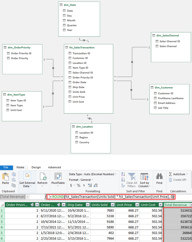
Power Pivot is an advanced data modeling tool that allows you to create sophisticated data models and calculations within Excel. By leveraging Power Pivot, you can handle larger datasets, establish relationships between tables, and perform complex calculations using measures and DAX (Data Analysis Expressions) functions.

1. Data Model: Power Pivot enables you to create a data model by establishing relationships between tables based on common columns. This allows for efficient data storage and faster calculations.
2. Calculated Columns and Measures: With Power Pivot, you can add custom calculations to your data model using calculated columns and measures. Calculated columns are used to create new columns based on existing data, while measures are dynamic calculations that aggregate data based on the user’s selection.
3. DAX Functions: Data Analysis Expressions (DAX) is a formula language used in Power Pivot to create powerful calculations and data manipulations. DAX functions allow you to perform complex operations like time intelligence, filtering, and conditional aggregations.

PivotTables and PivotCharts are powerful tools that allow users to dynamically explore and visualize data in Excel. PivotTables enable you to summarize and reorganize large datasets, while PivotCharts provide a visual representation of the data, making it easier to identify trends and patterns.
To create effective PivotTables for your dashboard, follow these best practices:
1. Structure your data: Ensure your data is organized in a tabular format with clear headers and no blank rows or columns.
2. Apply filters and slicers: Use filters and slicers to allow users to interact with the data and focus on specific subsets of information.
3. Utilize calculated fields and measures: Enhance your PivotTable by creating custom calculations using calculated fields and measures.

PivotCharts are an essential component of creating interactive dashboards, as they provide a visual representation of your PivotTable data. To create impactful PivotCharts:
1. Choose the right chart type: Select a chart type that best represents your data and the insights you want to convey, such as a column chart for comparisons or a line chart for trends over time.
2. Customize your charts: Enhance the clarity and visual appeal of your PivotCharts by customizing elements like titles, legends, and data labels.
3. Make your charts interactive: Enable users to interact with your PivotCharts by adding filters and slicers, allowing them to drill down into specific data points or segments.

Slicers and timelines are pivotal for elevating dashboard interactivity. By incorporating these tools, users can seamlessly filter data, enabling a dynamic viewing workflow management advanced analytics experience.
Slicers and timelines are interactive filtering tools that allow users to quickly and easily explore data in your dashboard. Slicers provide a visual way to filter data based on specific categories, while timelines enable users to filter data based on date ranges.

To add slicers to your dashboard:
1. Create a slicer: Select your PivotTable or PivotChart, go to the “PivotTable Analyze” tab, and click on “Insert Slicer.” Choose the field you want to filter by.
2. Customize your slicer: Format your slicer to match your dashboard’s design by adjusting the style, color, and layout options.
3. Connect your slicer to multiple PivotTables and charts: To create a cohesive and interactive dashboard, connect your slicer to all relevant PivotTables and charts by right-clicking on the slicer and selecting “Report Connections.”

Timelines are particularly useful for dashboards that analyze data over time. To add a timeline to your dashboard:
1. Create a timeline: Select your PivotTable or PivotChart, go to the “PivotTable Analyze” tab, and click on “Insert Timeline.” Choose the date field you want to filter by.
2. Customize your timeline: Adjust the appearance of your timeline by modifying the style, format, and displayed time periods.
3. Use the timeline to filter your data: Interact with the timeline by selecting specific date ranges or dragging the handles to adjust the displayed time period.

Get ready to elevate your Excel dashboards with the game-changing feature of conditional formatting. By leveraging this powerful tool, you can visually represent data in excel tools a whole new light, making key insights pop and data trends more apparent.
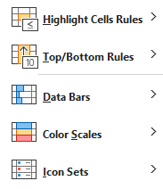
Conditional formatting is a powerful Excel feature that allows you to highlight cells or ranges based on specific conditions data patterns or criteria that explain data. In the context of dashboards, conditional formatting can be used to draw attention to key insights, trends, data patterns or anomalies in your data.

Excel offers several types of conditional formatting, including:
1. Data bars: Represent cell values as horizontal bars, making it easy to compare values across a range.
2. Color scales: Apply a color gradient to a range of cells based on their values, helping to visualize the distribution of data.
3. Icon sets: Assign icons to cells based on their values, providing a quick visual indicator of performance or status.

Data validation in Excel is crucial for maintaining data integrity. By setting rules and parameters, you can ensure that the data entered meets specific criteria, reducing errors and inconsistencies.
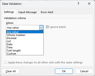
Data validation is an Excel feature that allows you to control the type of data entered into specific cells or ranges. By setting validation rules, you can ensure that the data in your dashboard is accurate, consistent, and within the expected parameters.
Excel offers several types of data validation, including:
1. List-based validation: Restrict cell entries to a predefined list of options, such as a dropdown menu.
2. Numeric and date-based validation: Set allowable ranges for numeric or date values, preventing entries outside the specified limits.
3. Custom formula-based validation: Create custom validation rules using formulas, allowing for more complex and specific criteria.

Forms in Excel provide a user-friendly interface for entering, editing, and viewing data in a structured manner. By incorporating combo box into your dashboards, you can simplify data input and make it easier for users to interact with the underlying data.

VBA (Visual Basic for Applications) is a programming language used to automate tasks and create custom functions in Excel. Macros are sets of instructions written in VBA that can be executed to perform repetitive tasks or complex operations.
Some common dashboard tasks that can be automated using VBA and macros include:
1. Refreshing data: Create a macro that automatically updates your dashboard’s data sources and refreshes PivotTables and charts.
2. Custom calculations: Write VBA functions to perform complex calculations or data manipulations not easily achieved with standard Excel formulas.
3. User interaction: Use macros to create interactive elements, such as buttons that trigger specific actions or updates in your dashboard.

Excel offers several powerful tools for data analysis, including Power Query for data transformation, Power Pivot for advanced modeling, PivotTables and PivotCharts for dynamic exploration, and Conditional Formatting for highlighting trends and anomalies.
To do data analysis in Excel, go to the Data tab and look for tools like Sort, Filter, PivotTables, and the Data Analysis ToolPak. These features allow you to perform calculations, create charts, and analyze trends.
To use data analysis in Excel, enable the Data Analysis ToolPak by navigating to File > Options > Add-ins. Once enabled, access it from the Data tab to perform advanced analyses such as regression, histograms, and descriptive statistics.
Open your Excel spreadsheet, ensure the Data Analysis ToolPak is enabled, and click on the Data Analysis button in the Data tab. Select the required analysis type (e.g., ANOVA, correlation) and follow the prompts to execute.
Start by preparing your data with clean formatting. Use Excel’s built-in functions like SUM, AVERAGE, and VLOOKUP. For deeper insights, use tools such as PivotTables or install the Data Analysis ToolPak for statistical methods.
To get the Data Analysis ToolPak in Excel, go to File > Options > Add-ins. Select Excel Add-ins from the dropdown menu and check Analysis ToolPak. Click OK, and it will appear in the Data tab.
You can find data analysis tools under the Data tab. If the Data Analysis ToolPak isn’t visible, you’ll need to enable it by adding it through File > Options > Add-ins. Once added, it will appear on the ribbon.
In this comprehensive guide, we’ve explored 8 advanced Excel features that will elevate data visualization and your dashboard skills to new heights. By mastering tools like Power Query, Power Pivot, PivotTables, and conditional formatting, you’ll be able to create dynamic and interactive charts and dashboards that provide valuable insights and drive data-driven decision-making.
You’ve learned how to:
As you continue to develop your Excel dashboard skills, remember to stay curious, experiment with new features standalone tools and techniques, and always strive to create dashboards that are both informative and engaging.

92% of students automate workflows, build CEO-ready dashboards, and streamline collaboration in < 1 hour. Don’t miss out!
🎯Master every Office 365 tool like Excel, Word, PowerPoint, Teams, Outlook and OneNote.
🎯Streamlined approach—no fluff, just rapid skill-building.
🎯Eliminate tedious tasks with intelligent automation.
🎯Transform everyday workflows into strategic power moves.
🎯Boost productivity and impress every boss.
🎯Real-World Projects – directly translate lessons into workplace wins.