If it’s your goal to become a master data analyst, you should learn data analytics with Excel. Using Excel you can organize, evaluate, and visualize data.
by Mihir Kamdar / Last Updated:
In this ultimate guide on Excel for data analytics, you’ll learn to:
Download our step-by-step tutorial file now by clicking on the icon below and follow along to enhance your Excel skills practically and efficiently!
Excel is an excellent resource for efficiently analyzing, manipulating, and visualizing large amounts of data.
In this guide detailing how to learn data analytics in Excel, we walk you through the process of data analysis from A to Z. In this free data analysis Excel course, we’ll cover cleaning and transforming data using Power Query, building relationships through data modeling, creating reports with Pivot tables, visualizing data, and finally creating a dashboard.
Whether you intend to master Excel data analysis through self-taught study or you’re brushing up on your existing skills, this comprehensive guide has everything you could need.
Power Query is a powerful tool for extracting, transforming, and loading (ETL) data. When you’re learning data analysis in Excel, starting with an Excel Power Query course is crucial.
So, let’s dive into what you need to know about Power Query to leverage this dynamic tool.
You can extract data from multiple sources using Power Query, including .txt, .csv, databases, and other Excel files. You’ll then be able to integrate this data into your workflow. Just follow the step-by-step example below to get started.
1.1.1. Importing Your Data
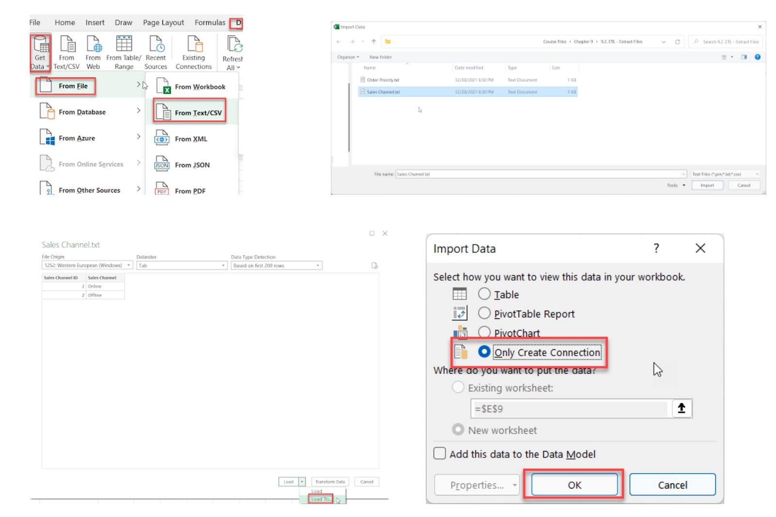
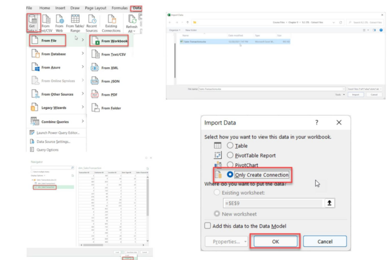
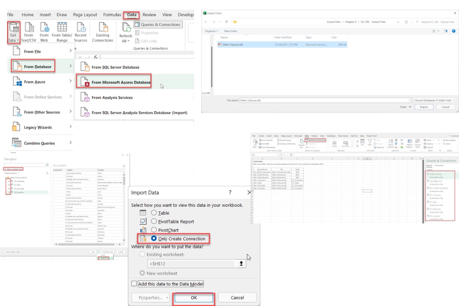
Access the Import Tool: Open Excel and navigate to Data > Get Data > Select From File if you’re importing a TXT, CSV, or Excel file, or select ‘Database’ if you’re importing from an Access database.
Select the File: Browse your system, select the file or database and click Import. A data preview will appear, showing the structure and allowing you to confirm it’s correct.
Load Options: Click on ‘Load To;, which will bring up different loading options. To keep the data connected without displaying it in the workbook, select Only Create Connection.
Confirm and Create Connection: Click OK to finalize the connection. This setup will dynamically update whenever the text file’s data changes, maintaining a live link in your query list.
1.2.1. Renaming Queries
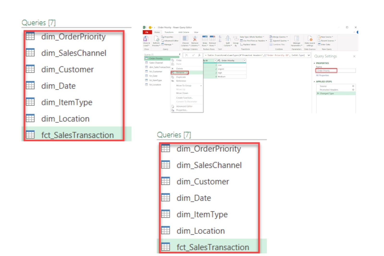
Renaming queries in Power Query improves organization and readability, especially when working with multiple data sources. By assigning clear, descriptive names to each query, you can easily identify and manage them throughout your analysis.
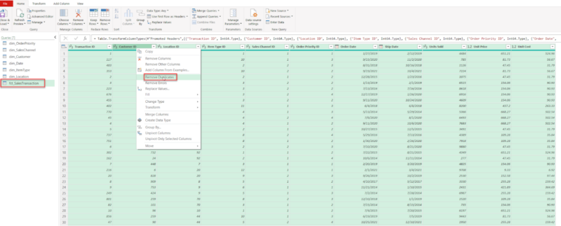
1.2.2. Removing Duplicates in Power Query
Removing duplicate rows is essential for data accuracy, particularly when working with large datasets. In Power Query, this function can quickly identify and eliminate repeated entries to ensure each row in the dataset is unique.
1.2.3. Replacing Null and Blank Values
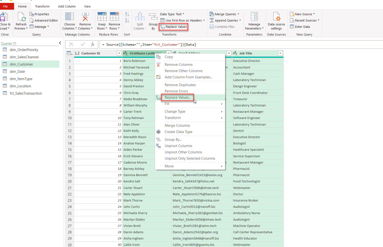
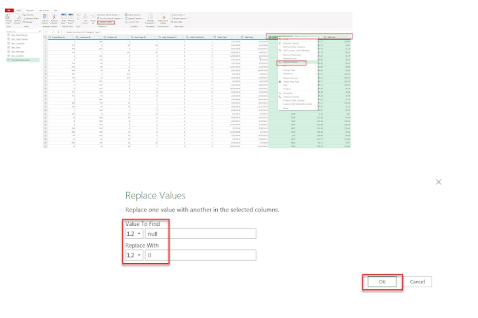
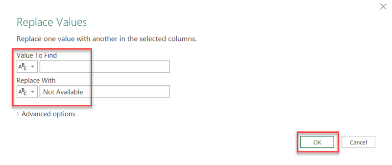
To maintain data consistency, it’s essential to replace any blank or null value, especially when performing additional calculations. In Power Query, you can replace any null value with a specific number, such as “0,” in designated columns to avoid a false result. You can also replace an empty string with text values that act as a placeholder. For example “Not Available” would identify the missing value in cell.
Follow our visual examples below.
1.2.4. Merging Columns
Merging columns in Power Query can create more concise data by combining related information into a single field. In our example, the Region and Country columns in the dim_Location query will be merged to form a unified Region-Country field.
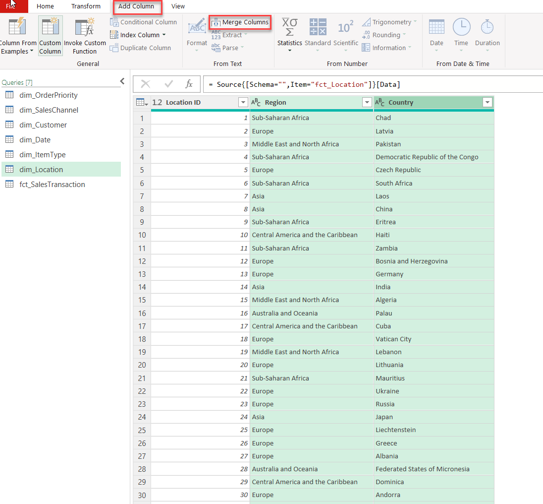
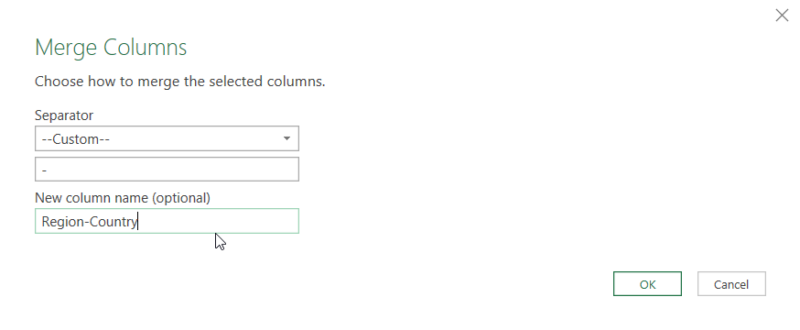
To master basic transformations in Power Query, you should also know how to change text case to ensure you can find data that is case sensitive, trim and clean data, split columns, and extract data. You can learn more about the basic transformation functions within Power Query in our free Power Query course “Power Query: A Comprehensive Guided to ETL in Excel.“
Power Pivot is a powerful tool in Excel for data modeling and analysis. It enables users to import data from various sources, transform it, and create relationships between tables. With Power Pivot, you can create calculated columns and custom measures using DAX (Data Analysis Expressions), enhancing data analysis beyond standard Excel functions and features. You can display the results in a PivotTable or visualize it in a PivotChart.
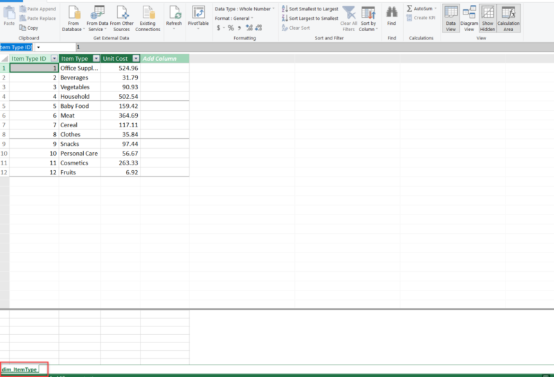
To begin data analysis in Power Pivot, begin by importing the data. You can import data from various sources, including Excel tables, other Excel files, and Access databases. Once imported, these data sources combine into a cohesive Data Model, enabling unified analysis.
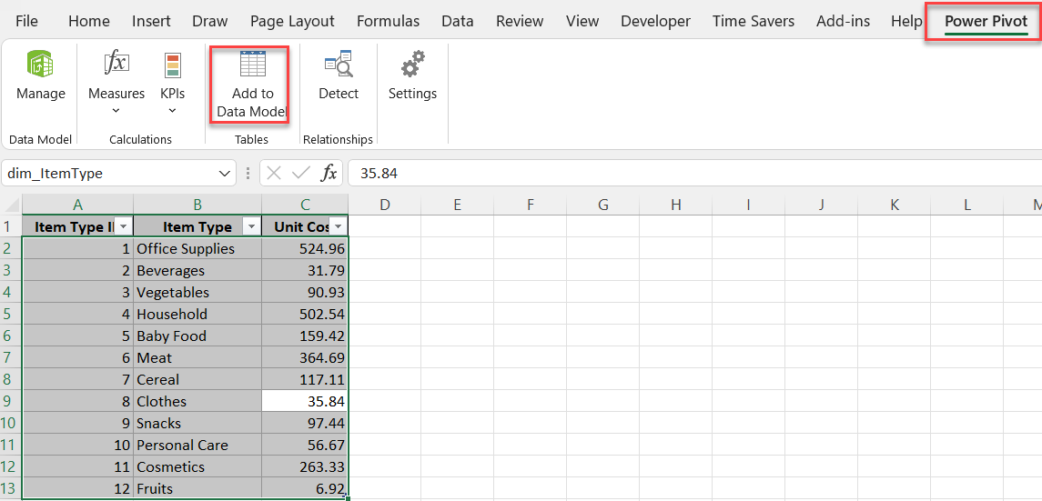
2.1. Importing Data from Excel Table in Power Pivot
To import a table from Excel:
2.2. Importing Data from an Excel File in Power Pivot
Power Pivot also supports importing entire Excel files. This function is beneficial when consolidating data across multiple files or worksheets.
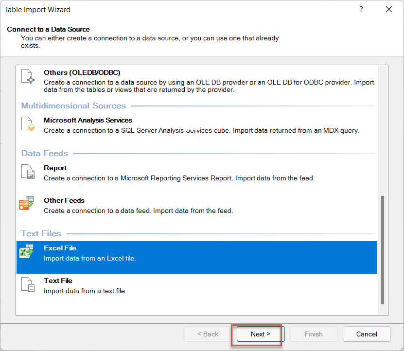
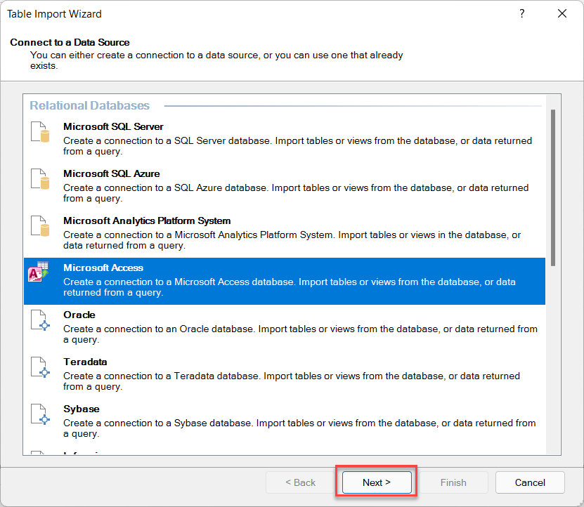
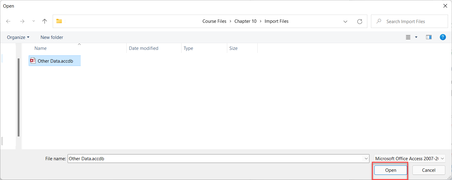
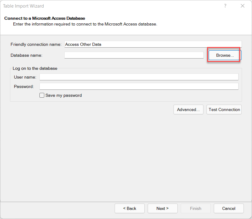
2.3. Importing Data from an Access Database in Power Pivot
For larger, structured data sources, Power Pivot allows importing data directly from Access databases.
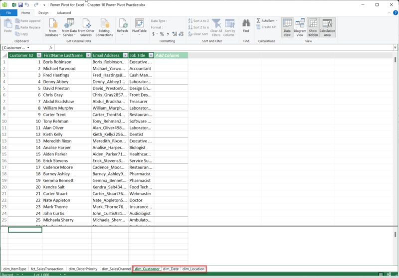
2.4. Building Relationships in Power Pivot
Relationships are vital in Power Pivot, connecting tables to enable cross-referencing and in-depth analysis. By linking tables, Power Pivot allows you to calculate and evaluate data from multiple perspectives.
To build relationships:
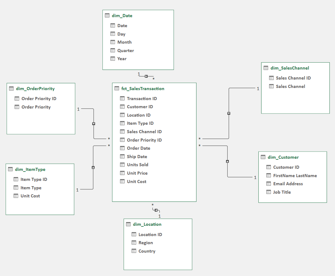
2.5. Utilizing DAX Formulas in Power Pivot (Brief Introduction)
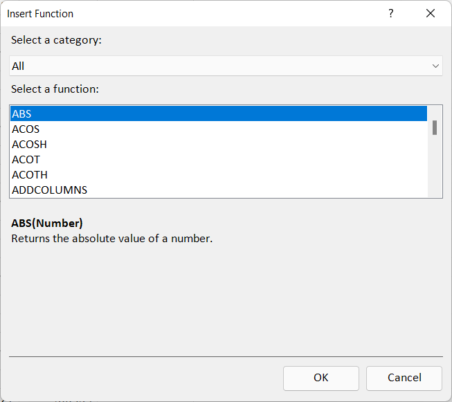
Data Analysis Expressions (DAX) is a specialized language for creating advanced calculations in Power Pivot. DAX formulas can be used to conduct logical functions and create calculated columns or measures, adding a layer of sophistication to your analysis.
This is how you can find DAX formulas:
If you’re having trouble with the above example, follow our visual example below.

2.6. Power Pivot Measures
Measures in Power Pivot aggregates data across a dataset and is context-sensitive, adapting to filters set in a PivotTable. For example, a measure for Total Revenue would sum values dynamically based on data slicers and filters.
Measures make Power Pivot especially powerful, as they enable dynamic, reusable metrics that adapt to the user’s analysis needs.

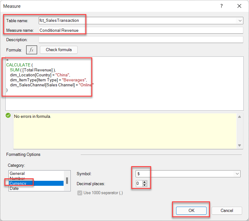
Table Name = fct_SalesTransaction (This is where measures will be saved).
Measure Name = Conditional Revenue
Formula = The formulas in the example below will provide total revenue after going through three filters, such as where Country = “China,” Item Type = “Beverages,” and Sales Channel = “Online.”
Syntax
=
CALCULATE (
SUM ([Total Revenue]),
dim_Location[Country] = “China”,
dim_ItemType[Item Type] = “Beverages”,
dim_SalesChannel[Sales Channel] = “Online”
2.7. Calculated Columns
Calculated columns are row-level calculations that populate a new column based on one formula. They are ideal for creating metrics like Total Cost or Profit.
Example:
Total Revenue: = ROUND(fct_SalesTransaction[Units Sold] * fct_SalesTransaction[Unit Price], 0)
Total Cost: = ROUND(fct_SalesTransaction[Units Sold] * fct_SalesTransaction[Unit Cost], 0)
These calculations allow more granular insights, adding value to the data model.
2.8. Creating a Pivot Table Report in Power Pivot
Power Pivot supports creating reports that span multiple tables, making it easy to analyze trends, compare performance metrics, or explore detailed insights and statements.
To create a PivotTable:
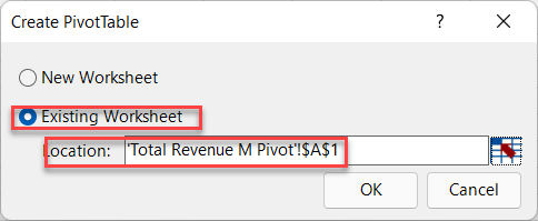
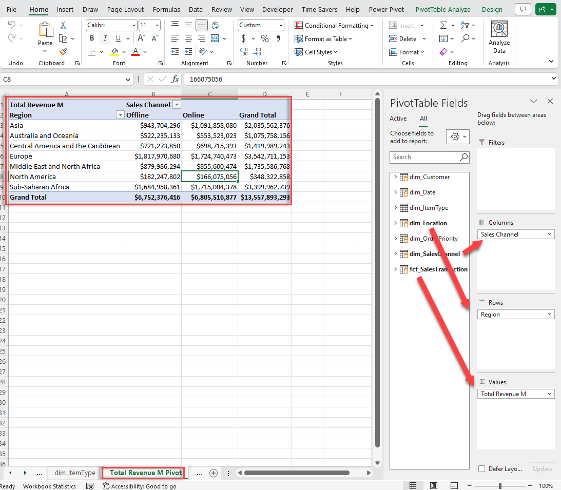
In our comprehensive guide on Excel Pivot Tables we detail how to create Pivot Tables from A to Z. In this Excel for data analysis we’ll give you insights into making Pivot Tables work for data analytics with Excel.
Basic Components of a Pivot Table
3.1. Preparing Data for a Pivot Table Analysis
Pivot Tables are incredibly powerful, but their effectiveness relies heavily on the quality and structure of your data.
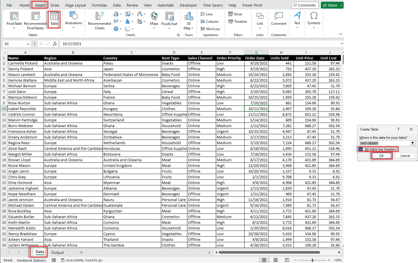
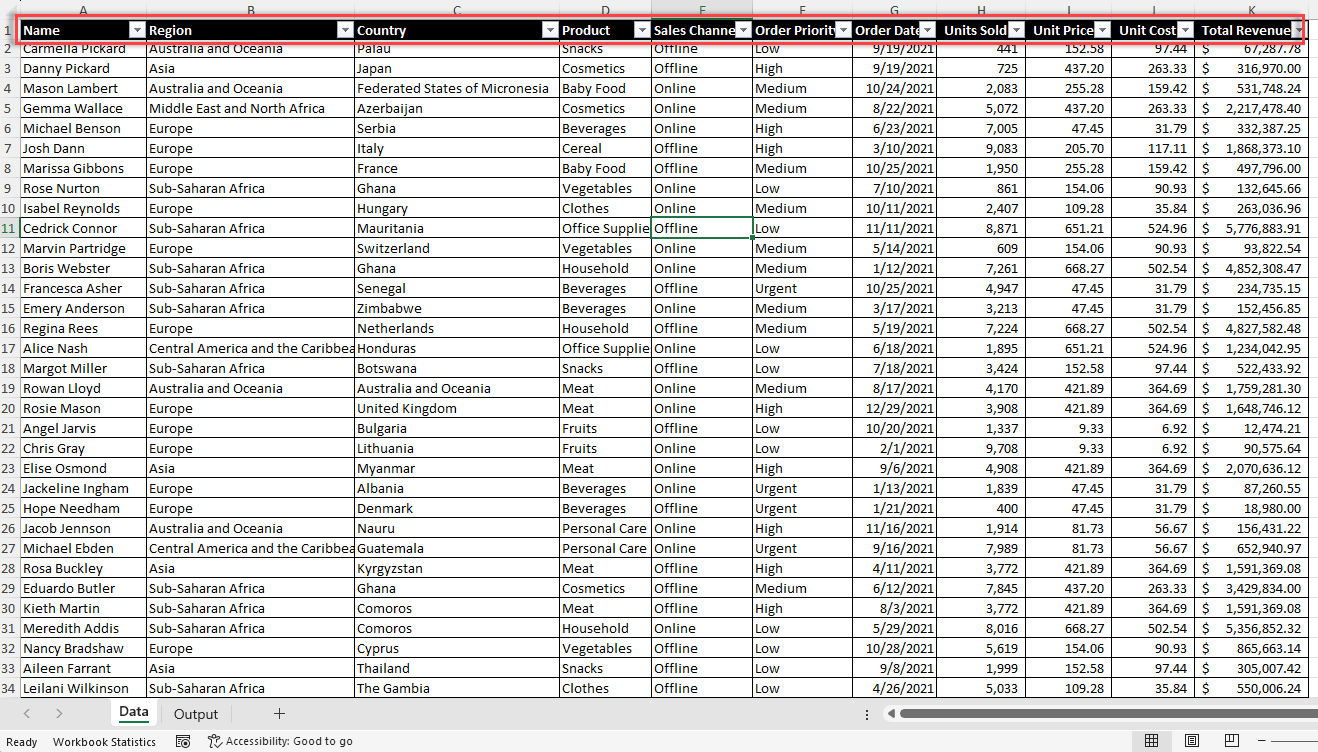
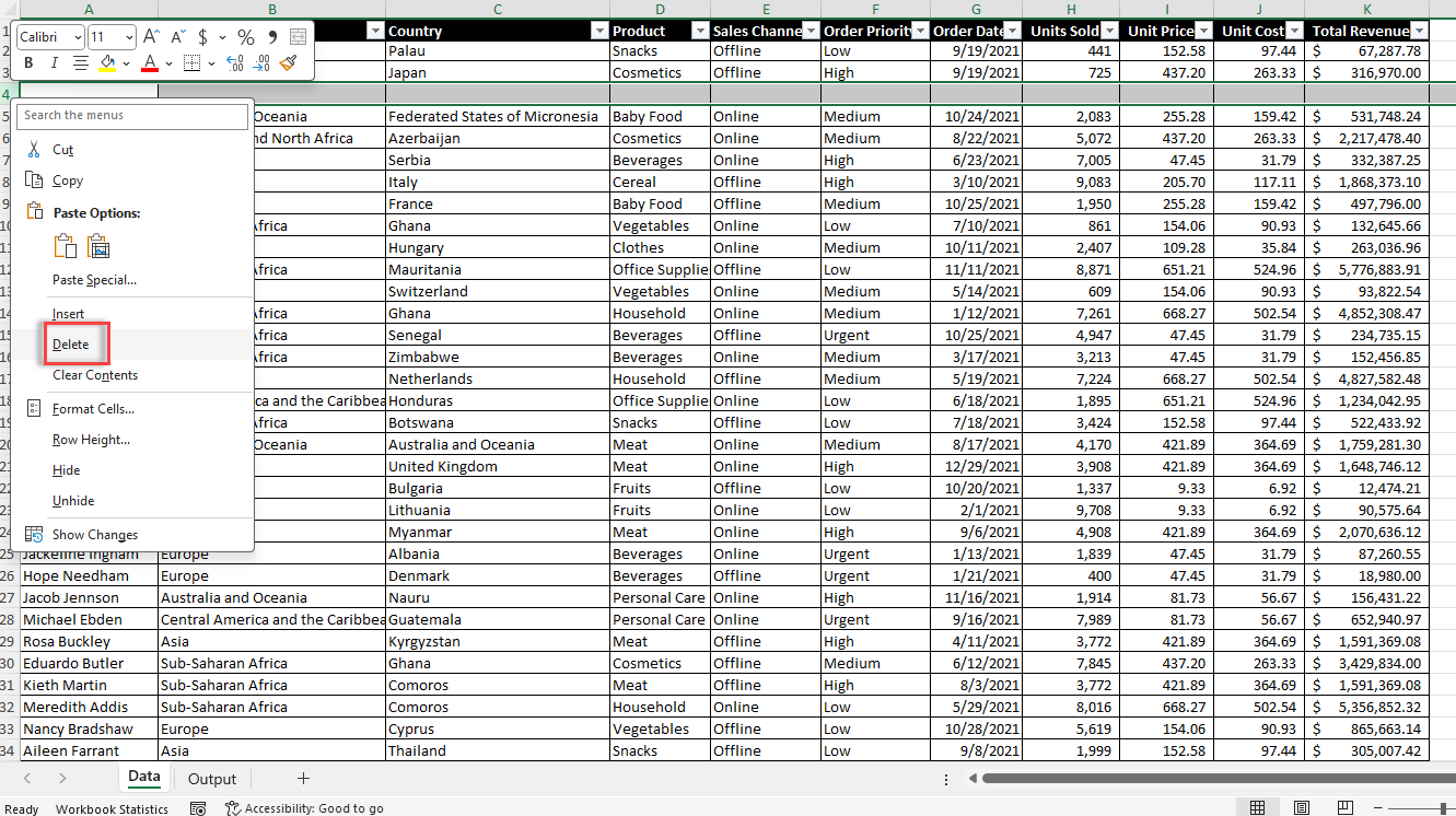
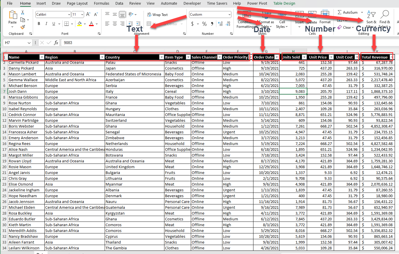
3.1.1. Structuring Data in Pivot Tables
To create effective pivot tables, your source data should be well-structured and organized. Here are some key principles to follow:
3.1.2. Cleaning and Preparing Your Data
Before creating a pivot table, it’s crucial to clean and prepare your data to ensure a true result and a smooth analysis process. Here are some steps to follow:

Choose the Criteria for Managing Missing Data: Determine how to treat missing or otherwise blank rows or values in your dataset (e.g., remove rows with missing data or fill in the blank value with appropriate placeholders).


3.2. Building a Pivot Table
To Create a new Pivot Table in Excel, do the following:
Excel will create a new pivot table in the specified location, with the PivotTable Fields pane appearing on the right side of the screen.

3.3. Adding Fields to a Pivot Table
To build your pivot table, drag and drop fields from the PivotTable Fields pane into the following areas:

3.4. Customizing the Layout and Fields of the Pivot Table
One of the key advantages of pivot tables is its function in Excel to quickly rearrange and pivot fields to explore data from different angles.
(See this simple example below)

3.4.1. Customizing Your Pivot Table’s Layout
You can customize the layout of your Pivot Table using the “PivotTable Tools” toolbar, which appears when you select any cell within the pivot table:
Design Tab: Choose from a variety of preset pivot table styles, or create your own custom style.
Layout Tab: Modify the pivot table’s layout, including adding subtotals, grand totals, and in the value section adjusting blank row and column display settings.
You can further customize your Pivot Table by following this example:
Using the standard formatting tools, you can further customize your pivot table’s appearance by modifying individual elements, such as font styles, colors, and number formatting.

Excel offers three main layout options for pivot tables: Compact, Outline, and Tabular. Each layout has its own advantages and use cases:
Using our visual example below you can change the layout of your Pivot Table:

3.4.2. Formatting Elements in Pivot Tables
In addition to applying overall styles and themes, you can also format individual elements within your pivot table, such as headers, labels, and value.
Examine the example below to learn about how to format elements in Pivot Tables.

3.5. Performing Calculations in Pivot Tables
To perform calculations in Pivot Tables, click on a cell, navigate to “Value Field Settings” and the choose the the type of calculation you would like to use to summarize data from the selected field.
Use the example below as a guide:

There are multiple functions you can perform with these calculations, including:
3.6. Visualizing data in Power Pivot
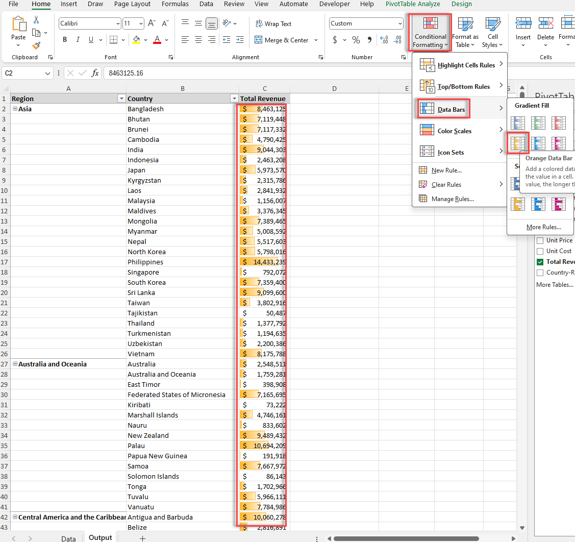
It’s possible to visualize data on Power Pivot by adding bars, graphs, colors, and icons to make the visual elements of your data cohesive.
You can find these powerful visual elements by navigating to Home and selecting all the conditions you’d like to apply.
Furthermore, in our simple example, we’ve highlighted how you can add data bars.
Simply navigate to Home > Conditional Formatting > Data Bars > Select the Bars you’d like to add.
Part of visualizing data in data analytics with Excel that we’ve discussed previously in Power Pivot, is mastering charts.
There are a variety of charts you can use to visualize data and simplify more complex scenarios.
In fact, there are more than a dozen charts to visually support your data analysis.
These are 14 charts we suggest when you’d like to conduct multiple comparisons.
4.1. Column Chart
Column charts are an effective means of displaying data variations over a period or comparing various elements. Typically, the categories are placed on one axis and the data values on another, allowing for clear visualization of changes or updates. Clustered column charts enable you to perform multiple comparisons with each comparison point in the narrative.
Select the data > Go to Insert > Recommended Charts > All Charts > Column > Cluster Column or any other column chart.

4.2. Bar Chart
Bar charts have a similar function to column charts, having a nearly the same result as the former chart.
To insert a bar chart in your data analysis select the data > Go to Insert > Recommended Charts > All Charts > Bar > Cluster Bar or any other bar chart.

4.3. Line Chart
Line charts are the ideal option to compare and contrast statements.

4.4. Pie/Doughnut Chart
Pie charts have a single function. These charts are ideal for comparative data and should be used with five or fewer data points. They enable you to convey simple statements effectively and can be used to test an argument.

4.5. XY Scatter Plot Chart
An XY chart’s most common use case is a scatterplot with two variables, but it can also display relationships among more than two variables.
Common examples of this chart in action include demonstrating correlation.

4.6. Area Chart
Area charts are created by plotting data on the vertical (y) axis and the category on the horizontal (x) axis. The total area under an area graph can be calculated by adding up all the areas under each rectangle stacked above each other.

4.7. Radar Chart
A radar chart diagram can simultaneously visualize three or more data sets.

4.8. Stock Chart
The stock chart is perfect for tracking two arguments and comparing and contrasting them.

4.9. Histogram Chart
Histograms are a great way to see the distribution of values when you have continuous measurements. They place your data into ranges or bins, each container representing counts / percentages for all observed cases within its scope.

4.10. Pareto Chart
The Pareto chart is an easy-to-understand chart that people use to identify and prioritize their efforts or decide what they want to focus on to achieve better results.
It’s an excellent chart for analyzing data with large numeric values and ranges.

4.11. Waterfall Chart
The waterfall chart is designed to show the gradual transition in quantitative values. Analysts mainly use it to understand or explain how something changes over time with an increment or decrement.

4.12. Box and Whisker Chart
Box and whisker charts are used to visualize the distribution of data. They have multiple functions in Excel and are often used in statistics, education, business, and engineering.

4.13. Treemap Chart
The Treemap charts provides an easy way to summarize (and evaluate) large amounts of hierarchical data. The dimensions are configured when plotting nodes based on numerical values assigned per node. This makes identifying trends between all categories straightforward.

3.14. Map Chart
The map chart has several functions, providing visual representations for data on geographical regions that are challenging to evaluate with other data table formats.

For in-depth analysis on charts, turn to our chart types guide.
Interactive dashboards are the final step to mastering data analysis in Excel. These dashboards allow you to track and measure key performance indicators (KPIs) and metrics. They provide a visual representation of complex data, making it easier to understand and evaluate. With interactive dashboards, you can change data inputs, filter data, and drill down into specific details to gain insights and uncomplicate data-driven decisions.

5.1. Layout and Design Principles for Dashboards
An effective dashboard layout should be intuitive, visually appealing, and optimized for the user’s needs. When assembling your dashboard components, consider the following design principles:
1. Prioritize information hierarchy
2. Maintain visual consistency
3. Maximize whitespace
It’s possible to master data analytics with Excel and this ultimate guide is just the first step to improving your skills. The trick to becoming a master data analyst is to continue honing your skills, repeatedly using one of the above formula, and you can relish in the not-so-unexpected-results.

92% of students automate workflows, build CEO-ready dashboards, and streamline collaboration in < 1 hour. Don’t miss out!
🎯Master every Office 365 tool like Excel, Word, PowerPoint, Teams, Outlook and OneNote.
🎯Streamlined approach—no fluff, just rapid skill-building.
🎯Eliminate tedious tasks with intelligent automation.
🎯Transform everyday workflows into strategic power moves.
🎯Boost productivity and impress every boss.
🎯Real-World Projects – directly translate lessons into workplace wins.